Preview image. Unlock full-res
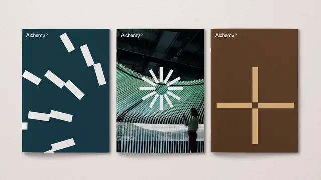
Three-part brand identity for Alchemy degree using modular geometric abstraction: diagonal rectangles, radiating lines, and crossed forms across teal, black, and brown palettes.
Summary
Three logo applications for Alchemy degree using distinct geometric motifs, each on a different tonal background, demonstrating brand flexibility through modular symbol systems.
Visual description
Three equal-width card-like compositions arranged horizontally. Left card: deep teal background with white angled rectangular bars scattered diagonally across the frame, plus a small "Alchemy degree" wordmark in sans-serif top-left. Center card: near-black background with the "Alchemy degree" wordmark above a mint-green radiating starburst pattern overlaid on diagonal striped textures, creating depth and movement. Right card: warm brown background featuring a centered geometric cross made of gold/cream-colored rectangles arranged at perpendicular angles, again with the wordmark at top-left. All three cards sit against a light neutral mounting surface.
Key takeaway
Flexible geometric language that adapts across applications: the same brand maintains cohesion through consistent wordmark placement and color strategy while the symbol shifts from linear bars to radiating forms to intersecting planes. This modularity lets a single brand feel fresh on each touchpoint without losing recognition.
Reuse notes
Ideal for luxury or design-focused agencies that need a system where individual applications feel custom-designed yet unmistakably unified. Works best when the geometric motif is clearly distinct from the wordmark (avoid competing focal points). The tonal backgrounds anchor each version; keep them consistently dark or neutral so the white and accent colors read crisply.