Preview image. Unlock full-res
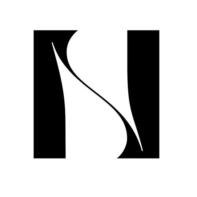
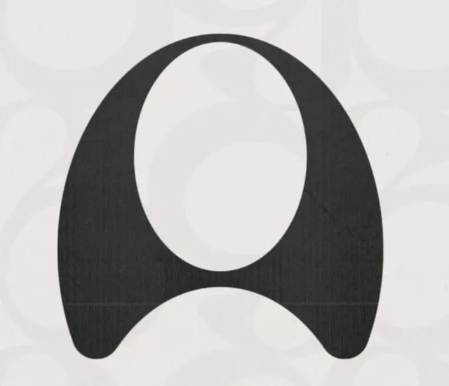
A monochromatic logo using bold, organic negative space to form an abstract letter A within a rounded rectangular frame.
Summary
A monochromatic logo using bold, organic negative space to form an abstract letter A within a rounded rectangular frame.
Visual description
A charcoal-dark mark on a light cream background. The symbol is an upside-down teardrop or almond shape, with one large oval negative (white) space cut from the top-center and a smaller oval void at the bottom, creating an abstract letterform that reads as an A. The overall shape is organic and rounded rather than geometric, with curved outer edges that suggest a contained icon or seal. The mark sits centered in the frame with ample negative space surrounding it.
Key takeaway
Negative space used as a primary design element, not an afterthought. The interplay of figure and void creates instant visual interest and memorable letterform. An organic silhouette (avoiding sharp angles) softens what is otherwise a bold, high-contrast mark.
Reuse notes
Excellent for technology, SaaS, or B2B brands seeking minimal, sophisticated identity systems. Works equally well at large (signage) and small (favicon) scales. Monochrome execution ensures it prints, animates, and scales without color-management headaches. Pair with a supporting wordmark or sans-serif typeface for a complete system.