Preview image. Unlock full-res
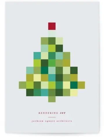
Architectural branding using stacked, interlocking squares in warm greens and yellows to form a stylized tree, with hand-lettered serif wordmark below.
Summary
An architectural identity system built from interlocking square color blocks that assemble into a tree form, anchored by serif branding below on a light-gray card.
Visual description
Pale gray card background. Center stage: a pyramidal arrangement of small squares stacked in rows, widening toward the base. Squares tile together in warm, muted tones: olive and forest greens, mustard yellows, moss tones, pale sage, and a hint of blue-green. A small crimson-red square sits isolated near the top, read as a tree accent or ornament. Below the tree, sans-serif text reads "RENDERING JOY" in burgundy, with "jackson square architects" in smaller caps underneath. The squares create an optical rhythm that reads instantly as growth/architecture while staying playful and warm.
Key takeaway
The modular grid system (each square a unit) lets the mark scale, recolor, and animate easily across applications. The warm, natural palette (avoiding bright primaries) conveys approachability and environmental awareness without sacrificing visual interest. A single accent color (the red square) breaks monotony and anchors the eye.
Reuse notes
Ideal for agencies with an architectural, environmental, or craft-focused story. The modularity translates well to animations (building the tree square-by-square), data visualization, and pattern systems. Works well on light backgrounds but risks fading on off-white; ensures contrast in application. The legibility of the "tree" silhouette is key; avoid collapsing too far or the abstraction breaks.
More like this






Keep what you find
A free account saves references to boards and can send you a weekly email of picks based on what you save.
To see every result, go Pro.