Preview image. Unlock full-res
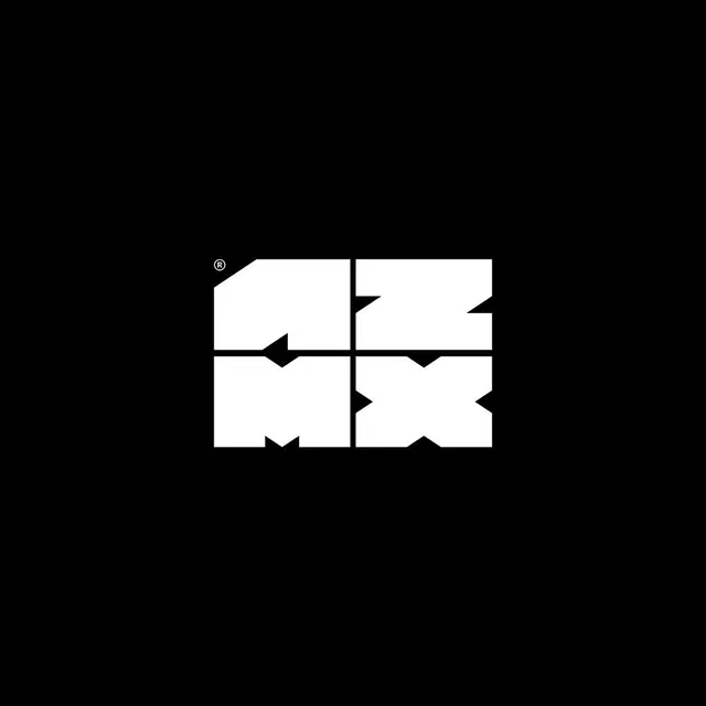
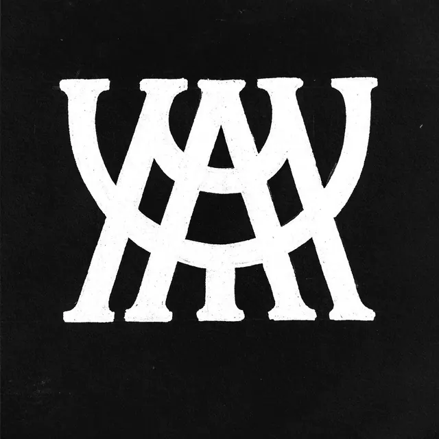
Bold serif monogram featuring thick letterforms with distinctive negative-space cutouts creating a heraldic, interlocking pattern on a dark background.
Summary
Monogram logo composed of interlocking serif letterforms with carefully carved negative-space cutouts, creating a geometric mark that reads simultaneously classical and contemporary.
Visual description
White serif letterforms (appearing as three interlocking characters) centered on a dark black background. The thick strokes of the serif typeface are interrupted by negative-space shapes cut from the letterforms, creating hollow geometric patterns (shield-like, circular, and angular forms). The cutouts serve both as visual interest and structural reinforcement, making the letterforms feel more like an interlocking emblem than simple type. The overall composition is perfectly centered and symmetrical, suggesting formality and timelessness.
Key takeaway
The use of negative space as both a sculptural element and a branding technique, adding complexity and visual weight without added strokes. The serif form choice grounds the mark in tradition while the geometric cutouts modernize it. This technique creates memorable visual distinction when scaled down or applied to various media.
Reuse notes
Perfect for luxury brands, law firms, heritage companies, or any entity requiring gravitas and established authority. The monogram approach works especially well when the brand has strong initials or a symbolic letter combination. Scale flexibly across letterheads, signage, and product labels without loss of legibility. The technique pairs best with minimal, refined color palettes and generous whitespace in layouts.