Preview image. Unlock full-res
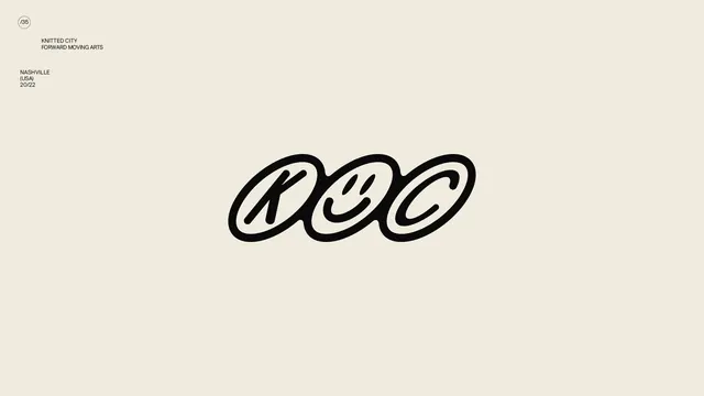
Hand-drawn monoline logo for Knitted City, a Nashville-based arts organization, with the letters intertwined to suggest continuous motion and connection.
Summary
Monoline identity mark for Knitted City, a Nashville forward-moving arts organization, with interlocked letters suggesting flow and continuity in a single continuous stroke.
Visual description
A hand-drawn monoline logo set against a light beige background, occupying the center space. Three letters appear to overlap and flow into one another, creating a seamless, ribbon-like form with thick, consistent stroke weight. The letters arc and interlock, suggesting movement and dance rather than rigid geometry. Thin outlines and organic curves dominate; the design has a gestural, human-made quality. Text identifying "Knitted City, Forward Moving Arts, Nashville (USA), 20/22" appears in a clean sans-serif in the upper left and lower left margins. A small circular page indicator "(35)" sits in the top-left corner.
Key takeaway
The flowing monoline approach makes separate letterforms feel unified and suggest continuous action. Hand-drawn letterforms with consistent stroke weight convey accessibility and warmth while remaining modern and memorable. The overlapping, ribbon-like structure creates the illusion of movement without literal motion graphics.
Reuse notes
Works well for arts organizations, nonprofits, and agencies wanting to convey creativity, approachability, and motion. The monoline treatment keeps it reproduction-friendly across digital and print. Best used at size scales where the letter detail remains legible.