Preview image. Unlock full-res
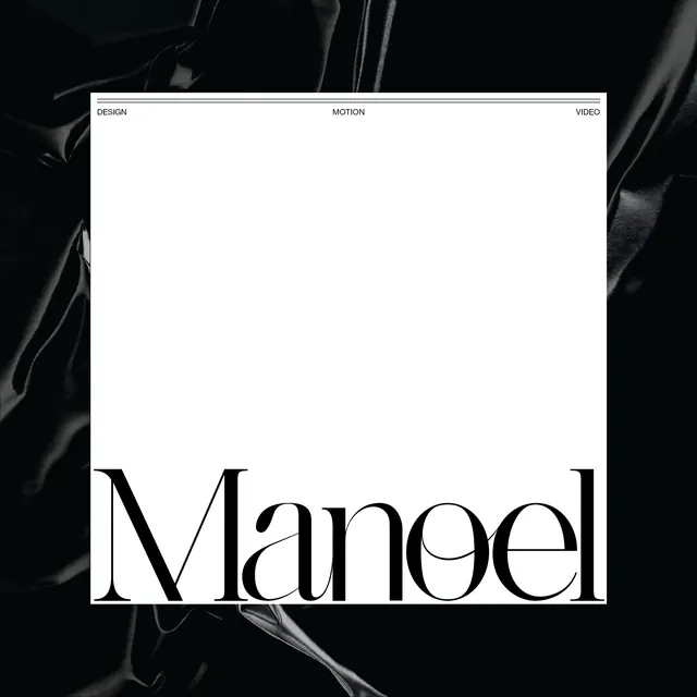
Portfolio website header with serif "Manoel" wordmark and three-tab navigation (Design, Motion, Video) on a white card against a dark abstract background.
Summary
A portfolio website interface featuring a large serif "Manoel" wordmark anchored in a white card, with three evenly-spaced navigation tabs at the top (Design, Motion, Video), set against a dark abstract background.
Visual description
A white rectangular card dominates the center, bordered by a thin horizontal line at the top containing three small-cap navigation labels: "Design" on the left, "Motion" centered, "Video" on the right. Below is empty white space, and at the bottom sits a large serif wordmark "Manoel" in black, extending nearly full width. The card is set against a dark, fluid, organic abstract background with soft gestural marks.
Key takeaway
The tabbed navigation at the card's header is the organizing principle: it segments the portfolio into distinct content areas while the wordmark provides a unified identity anchor below. The contrast between the structured tabs and the flowing background creates visual tension.
Reuse notes
Effective for creative portfolios where the client offers multiple service categories. The tab structure scales navigation without cluttering, and the large wordmark at the bottom provides a strong footer anchor. Works well on a dark background to frame the white card.
More like this



Keep what you find
A free account saves references to boards and can send you a weekly email of picks based on what you save.
To see every result, go Pro.