Preview image. Unlock full-res
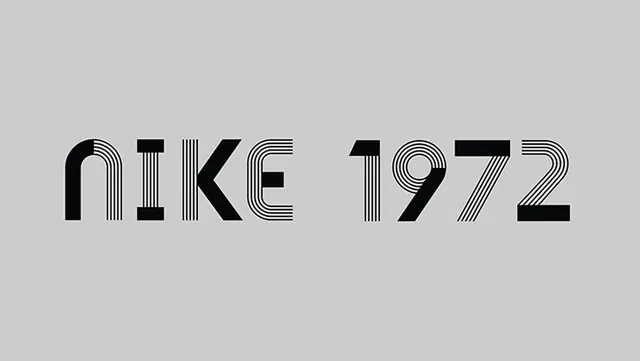
A stylized typographic treatment of the word 'NIKE' and the year '1972' using a linear, striped pattern.
Colormonochrome, high-contrast
Typesans-serif, oversized, all-caps
Tagsstripes, linear, monochrome, geometric, typography
Palette
#CCCCCC
#1E1E1F
Summary
A stylized typographic treatment of the word 'NIKE' and the year '1972' using a linear, striped pattern.
Visual description
The design features black text on a light gray background. Each letter and digit is constructed from varying patterns of vertical and diagonal parallel lines.
Key takeaway
The use of linear patterns creates a sense of movement and texture while maintaining a clean, structured aesthetic.
Reuse notes
Apply similar linear patterns to other brand elements or headlines to create a cohesive visual language.