Preview image. Unlock full-res
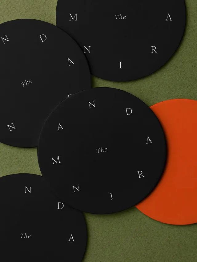
Six-slide carousel showcasing a luxury restaurant's branding, product design, and environmental graphics with minimalist serif typography and sophisticated styling.

Summary
A sophisticated branding and interior design project for a luxury restaurant, featuring minimalist serif branding, custom stationery, curated product mockups, and a monochromatic environmental aesthetic anchored by warm wood and polished materials.
Visual description
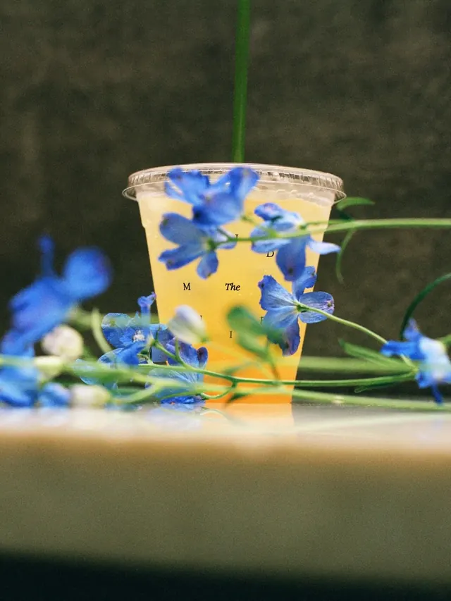
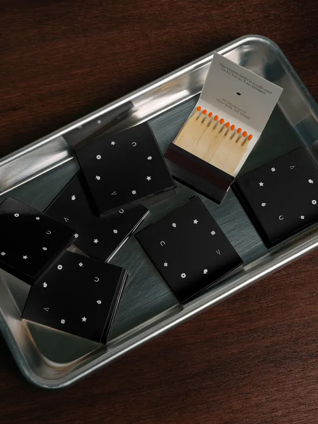
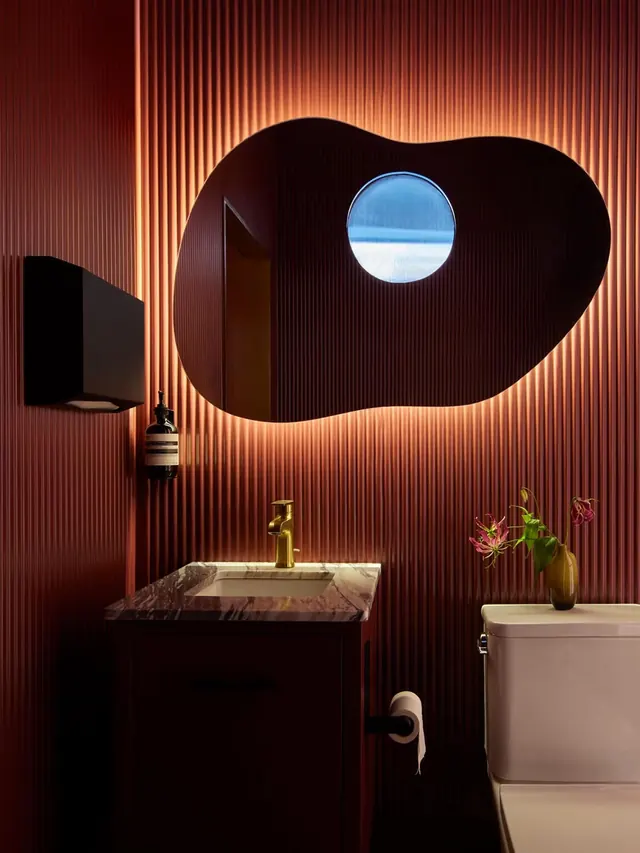
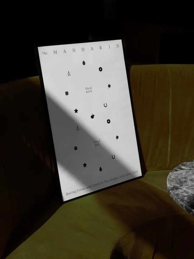
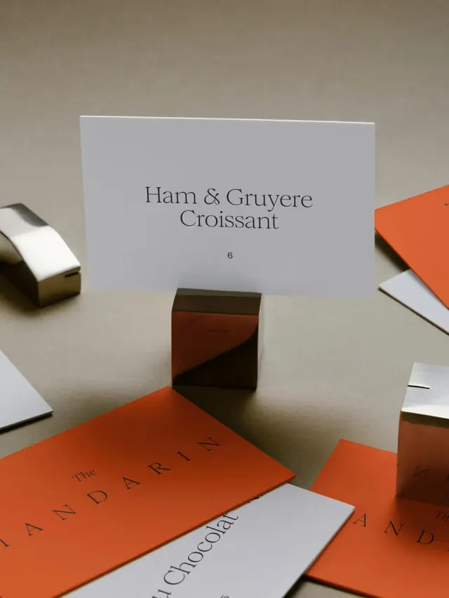
Slide 1: Overlapping black circles on soft green-beige background with white serif type spelling "THE MANDARIN" scattered across, plus a single red-orange circle creating an accent. Slide 2: A clear drink cup surrounded by blue delicate flowers on neutral background, with letterspacing reading "M The D I" across the image. Slide 3: Overhead flat-lay of black custom boxes with small white symbols (stars, moons, musical notes, dice) arranged on a metal tray against dark wood. White label at top reads "The MANDARIN NYC since 2024". Slides 4-5: Warm-toned bathroom interior photography-terracotta corrugated metal walls with dramatic neon orange glow outline around a large organic-curved mirror, white sink with brass faucet, green plant in ceramic vase. Slide 6: Menu card "Ham & Gruyere Croissant 6" displayed on tray with brass tape and orange-coral accent pieces-minimalist plating presentation.
Key takeaway
Cohesive restraint across touchpoints: consistent serif typeface, monochrome/warm-neutral palette, and refined material choices (metal, ceramic, brass) unify disparate elements. The single accent color (red-orange) acts as a visual through-line. Typography placement-scattered, playful on branding assets but structured on environmental/packaging-shows flexibility within a coherent system.
Reuse notes
Ideal reference for hospitality and luxury dining branding. The approach works because it balances warmth (natural materials, accent color) with modernist restraint. The color palette translates well to both print collateral and interior environments. Effective for upscale independent restaurants or small hotel groups wanting sophistication without coldness. Note: the wide tonal range (black to cream) requires confident photography and lighting to avoid muddiness in reproduction.
From this post: The Mandarin NYC branding and environment design
View post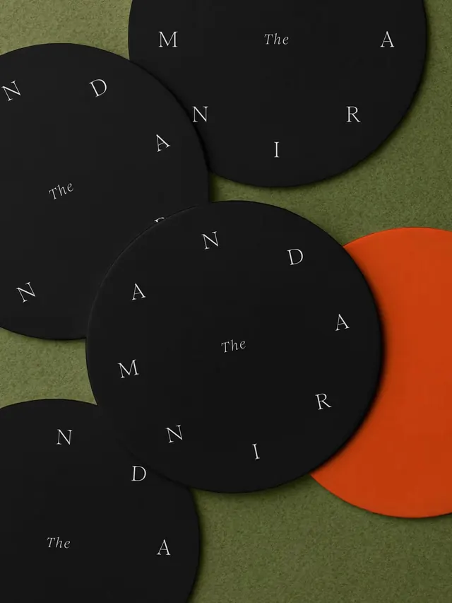
More like this

Keep what you find
A free account saves references to boards and can send you a weekly email of picks based on what you save.
To see every result, go Pro.