Preview image. Unlock full-res
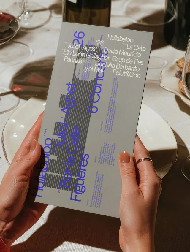
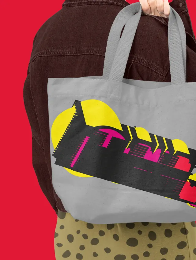
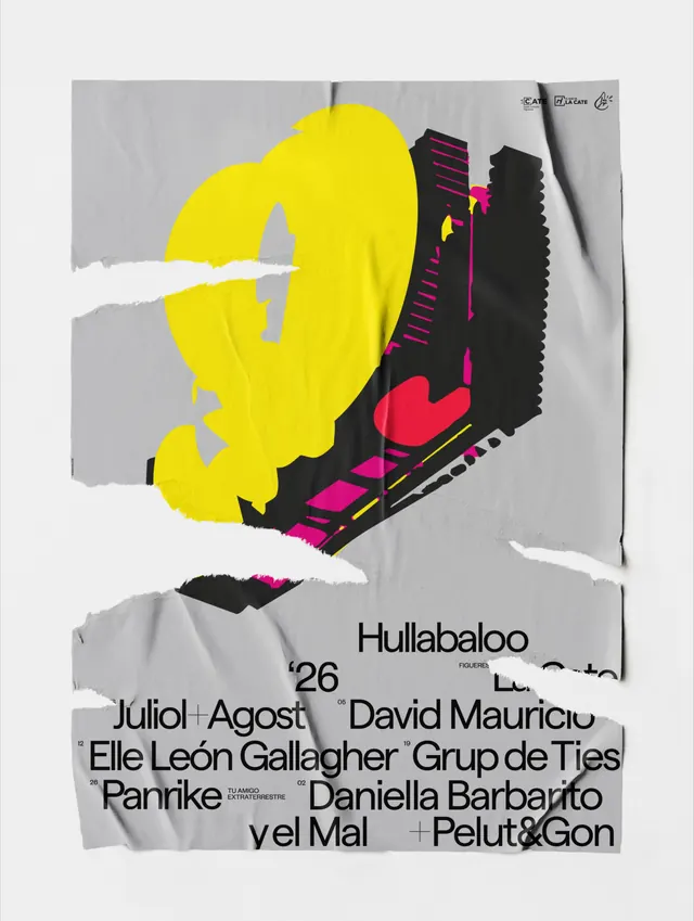
Comprehensive festival identity for Hullabaloo 2026 with bold yellow and magenta color blocking, modular geometric typography, and cohesive merchandise and digital applications.

Summary
A vibrant festival branding system for Hullabaloo 2026 featuring a bold geometric visual language combining neon yellow and magenta with stark black, applied across printed collateral, apparel, digital interfaces, and 3D animated logo variations.
Visual description
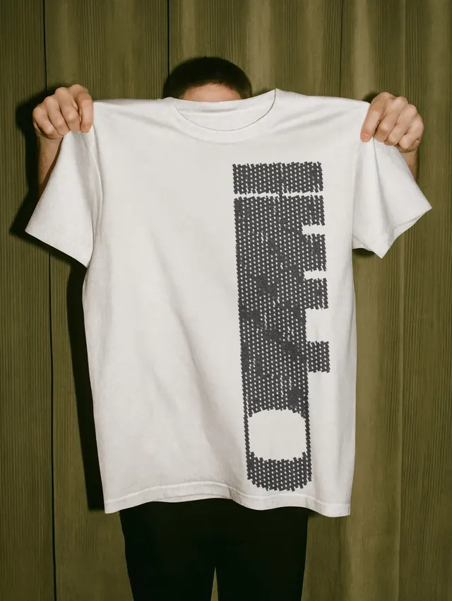
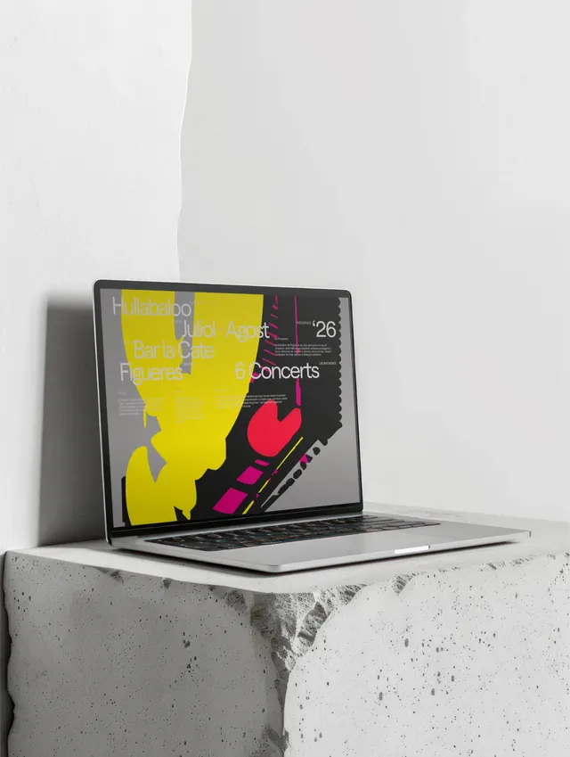
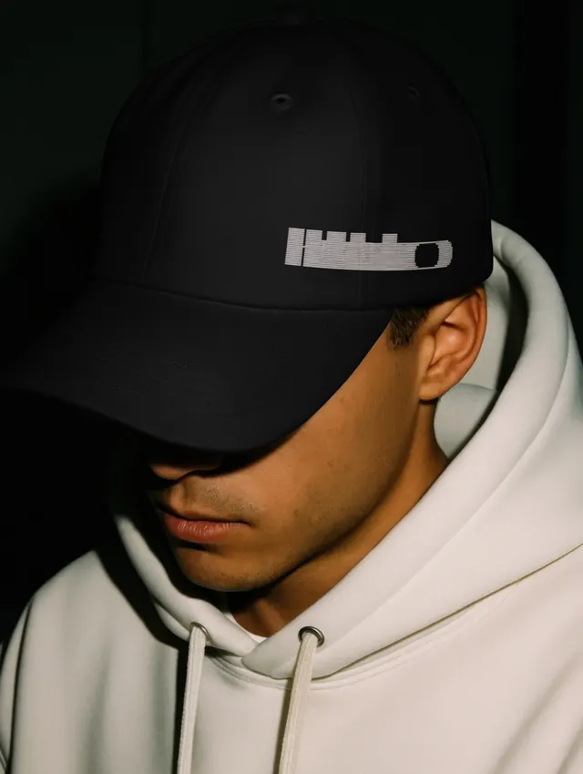
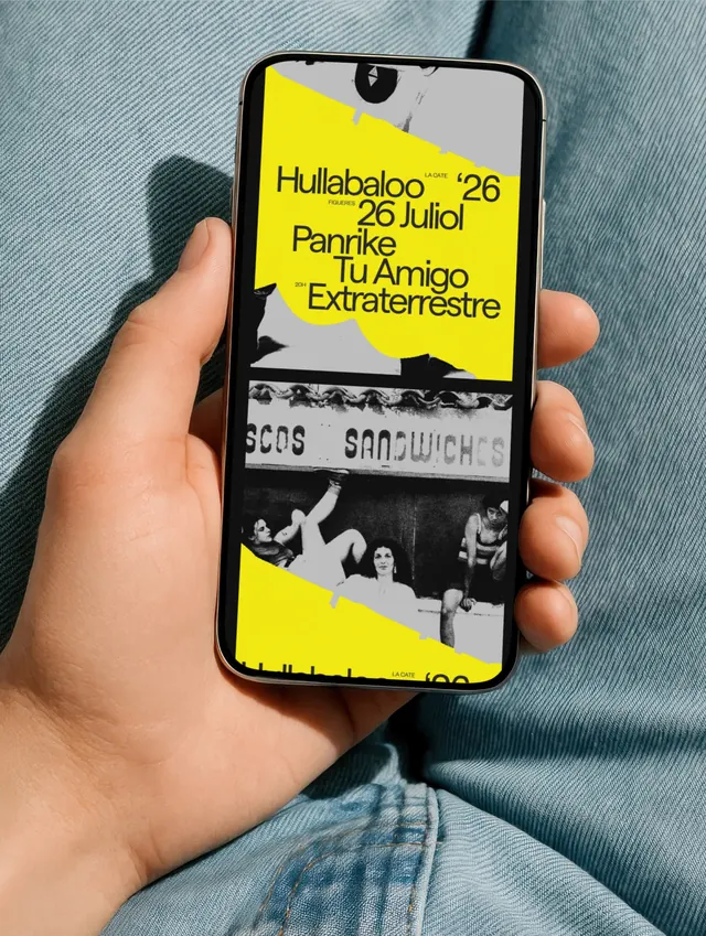
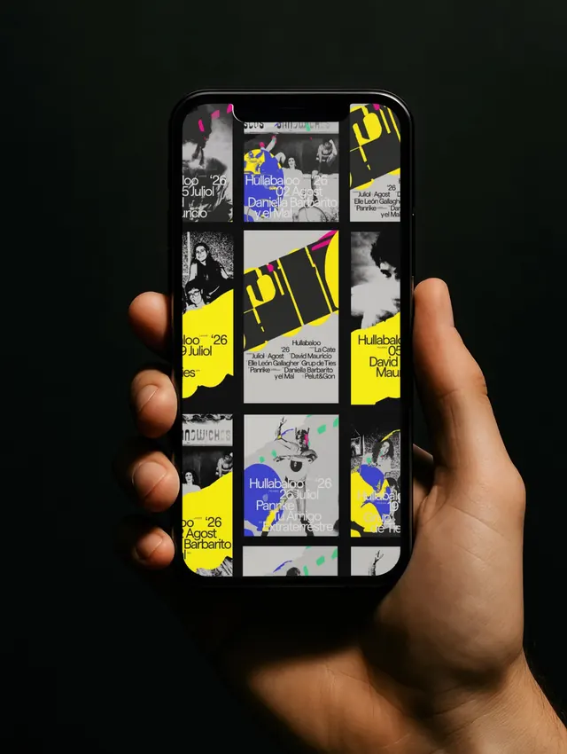
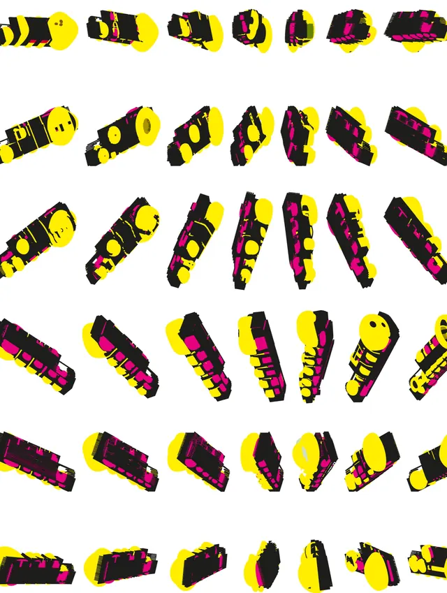
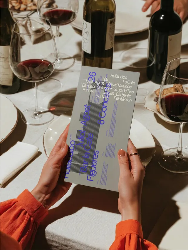
The identity centers on a modular typeface built from a grid of horizontal lines that form blocky, nearly illegible letterforms-the word "Hullabaloo" rendered in this style dominates most compositions. Color strategy uses pure neon yellow (#FFFF00) as the primary shape and magenta (#FF1493) as accents, always against black or light gray. Applied across: a folded poster with overlapping text layers in blue and white; white and light-colored apparel (t-shirt, baseball cap) bearing the pixel-pattern logo; a tote bag with the neon geometric wordmark against a bright red background; a laptop screen mockup showing the identity on a web layout; a smartphone mockup with the festival poster including black-and-white photography; a grid of 3D-rendered isometric variations of the modular wordmark, showing rotation and perspective shifts in yellow and magenta; and a promotional image of a model wearing oversized white sunglasses and Hullabaloo branded apparel, all set against soft or high-contrast backgrounds.
Key takeaway
The modular, grid-based letterform becomes the primary hero-legibility is sacrificed for visual impact and mechanical precision. The strategy of high saturation (neon yellow and magenta) with black creates instant, playful energy. The extensive 3D rotation study (final slide) demonstrates how the identity system extends into dimensional space, suggesting motion and adaptability across contexts. Repeating the same graphic language across print, apparel, digital, and 3D shows systematic brand consistency.
Reuse notes
Ideal for music festivals, youth-facing events, or tech products that need high energy and irreverent personality. The grid-based letterforms work at any scale but require breathing room; pair with plenty of white or black space. The neon + black palette is demanding-use sparingly as an accent system if a softer approach is needed. The modular 3D variations are excellent for animated transitions, social media loops, or interactive installations. Works best on dark or light backgrounds; mid-tone backgrounds will muddy the contrast. The apparel and physical mockups suggest this is a campaign built for Instagram Stories and carousel posts, so consider aspect ratios and scrolling hierarchy when adapting.
From this post: Hullabaloo 2026 festival identity system
View post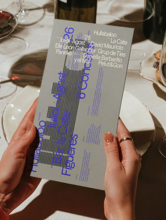

More like this
Keep what you find
A free account saves references to boards and can send you a weekly email of picks based on what you save.
To see every result, go Pro.