Preview image. Unlock full-res
17-slide carousel showcasing Ambev's "Backstage" editorial branding platform and merchandise, revealing operational storytelling behind the company's brands.

Summary
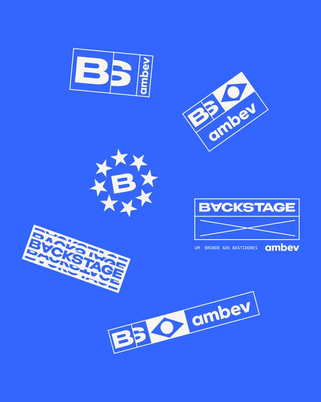
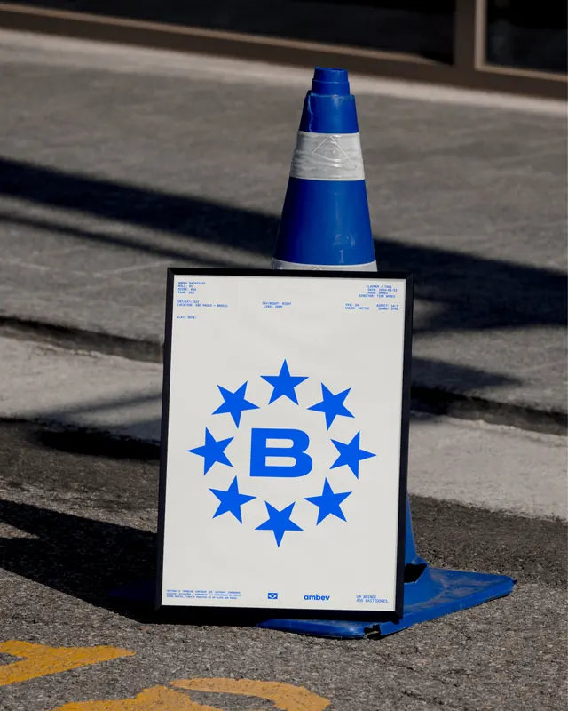
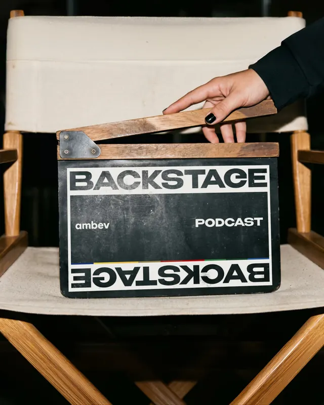
A comprehensive brand expression for Ambev's "Backstage" institutional platform, presented through apparel, environmental signage, editorial layouts, and behind-the-scenes production stills. The campaign shifts the corporate narrative to reveal the people and systems behind Brazil's iconic beverage brands.
Visual description
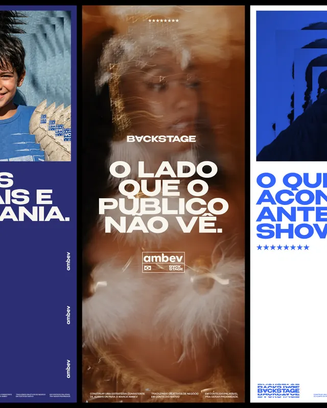
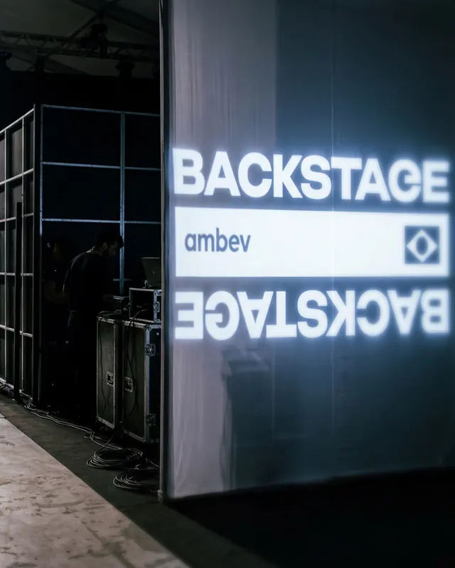
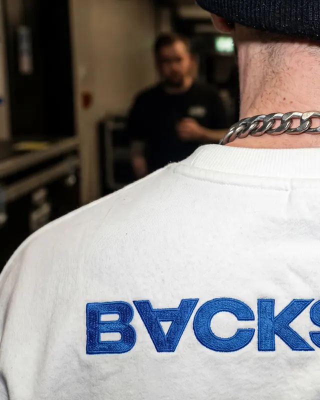
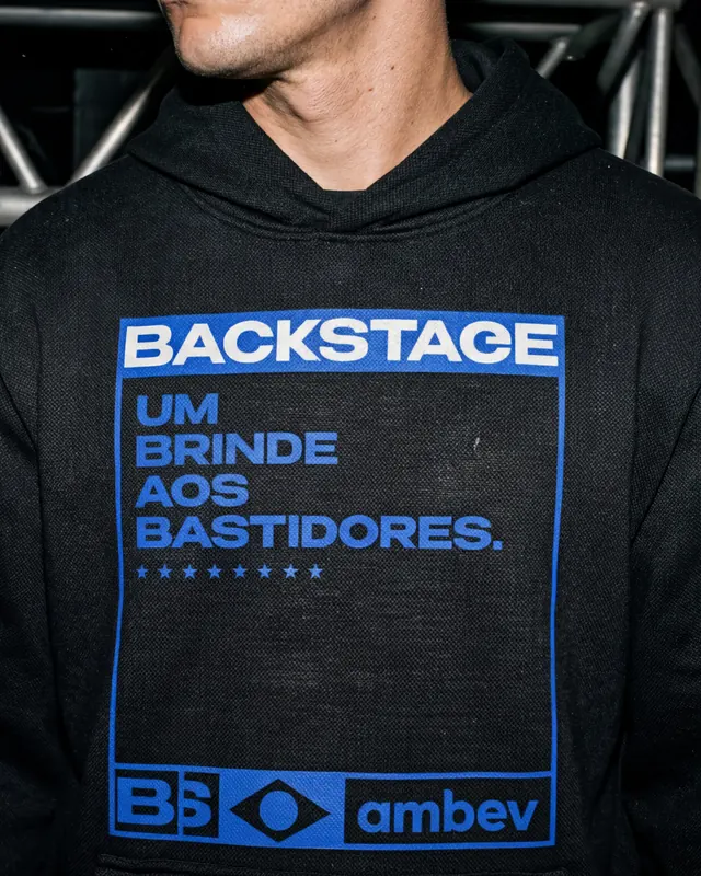
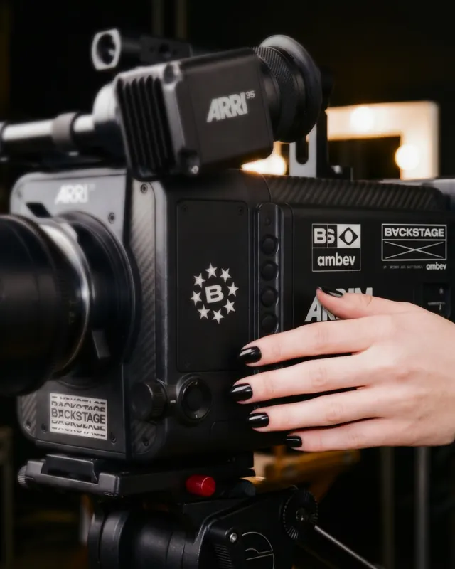
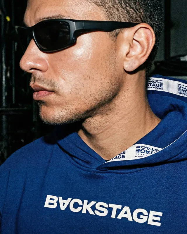
The carousel opens with a high-contrast black-and-white cover frame featuring the "BACKSTAGE" wordmark (with one letterform inverted) above blue-tinted video stills. Slide 2 shows a person in a yellow colorblock shirt holding a poster. Slide 3 presents a logo system on bright electric blue background: Ambev corporate mark, SKQL, Tonica Antarctica, Corona, and others in white. Slide 4 depicts a person wearing a blue oversized jacket emblazoned with "BACKSTAGE" in stretched, uppercase sans-serif, standing against industrial metal scaffolding. Slide 5 is a black-and-white frame suggesting behind-the-scenes video capture. Slide 6 is a triptych: left side shows apparel detail with blue geometric mark, center presents portraiture with oversized sans-serif headline "O LADO QUE O PÚBLICO NÃO VÊ" (The Side the Public Doesn't See) over warm tones and animal texture, right side shows silhouettes in moody blue. Remaining slides feature apparel close-ups (hoodie with statement text, t-shirt detail), environmental signage (backlit "BACKSTAGE" letters with Ambev logotype), product photography, and individual portraits wearing branded accessories. Color palette alternates between deep black, electric cobalt blue, crisp white, and occasional warm earth tones. Typography is heavy, modern sans-serif with tight tracking and deliberate cap treatment throughout.
Key takeaway
The inversion of institutional brand identity into wearable, visible culture. The design demonstrates how to make operational storytelling tangible through consistent visual language across merchandise, environmental graphics, and editorial photography. The bold color choice (electric blue against black and white) creates unmistakable brand recognition while the oversized, distorted typography signals a shift from corporate formality to cultural authenticity.
Reuse notes
Effective for brands seeking to humanize institutional narratives or reveal behind-the-scenes processes. The color and type system is strong enough to work across scales-from apparel to large-format signage to social media. The carousel format itself (mixing product, portraiture, and environment) is a useful template for multi-product brand launches or cultural repositioning. Note the consistent blue/black/white palette helps visual coherence across diverse slide content. Works well for B2B brands, beverage/food, and companies with portfolio narratives to tell.
From this post: Ambev Backstage institutional branding campaign
View post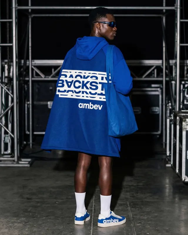

More like this


Keep what you find
A free account saves references to boards and can send you a weekly email of picks based on what you save.
To see every result, go Pro.