Preview image. Unlock full-res
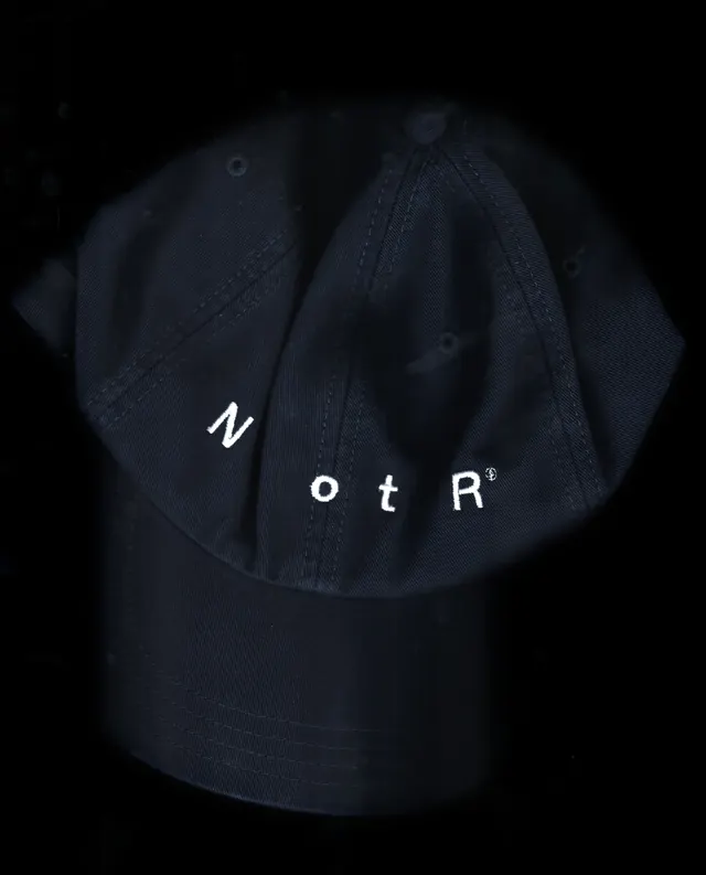
Bold, typographic-driven identity for an upscale London pizza restaurant using a deliberately fragmented wordmark system and experimental typography layered over photography and architectural forms.

Summary
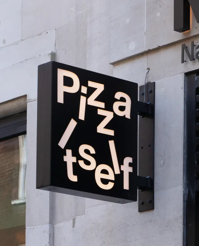
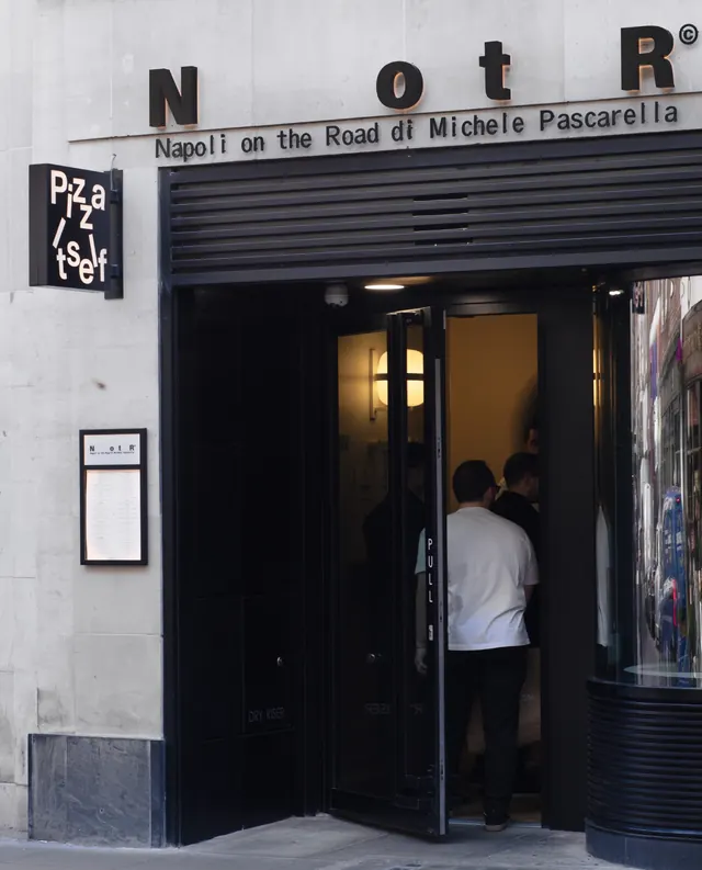
A Soho pizza restaurant's visual system that rejects convention through a radically fragmented wordmark. The NotR/otR branding breaks apart, rotates, and recombines across signage, menus, and collateral, creating a distinctive identity that feels uncompromising and bold within the crowded hospitality landscape.
Visual description
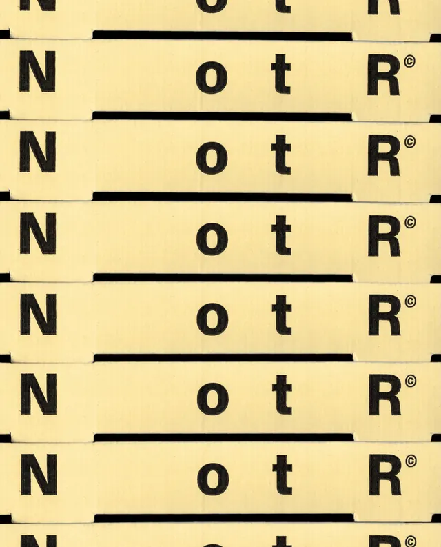
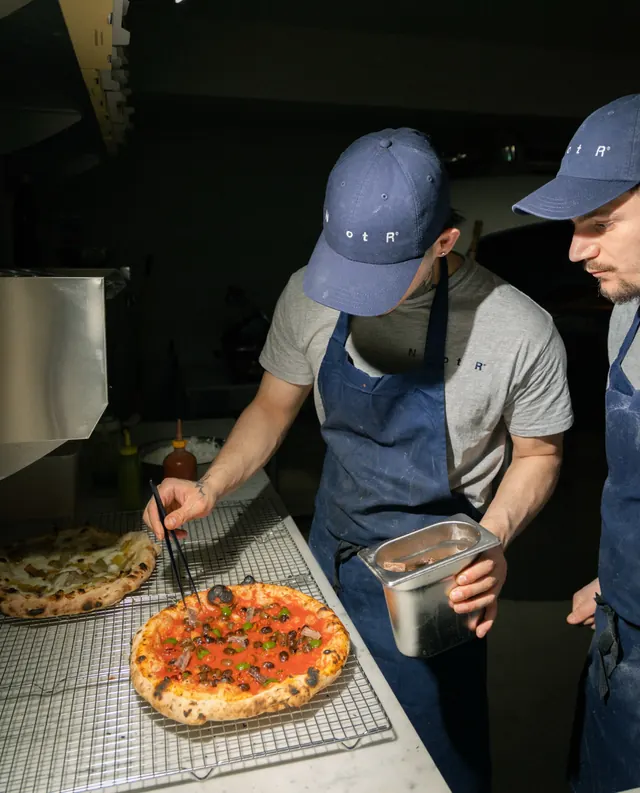
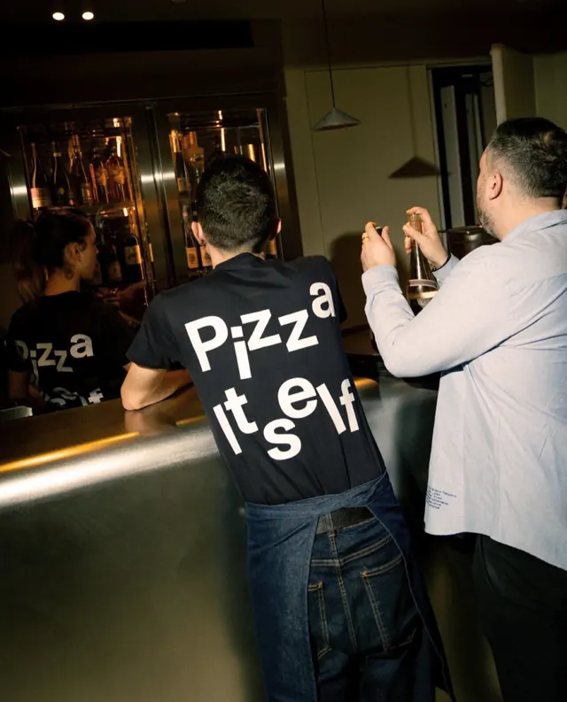
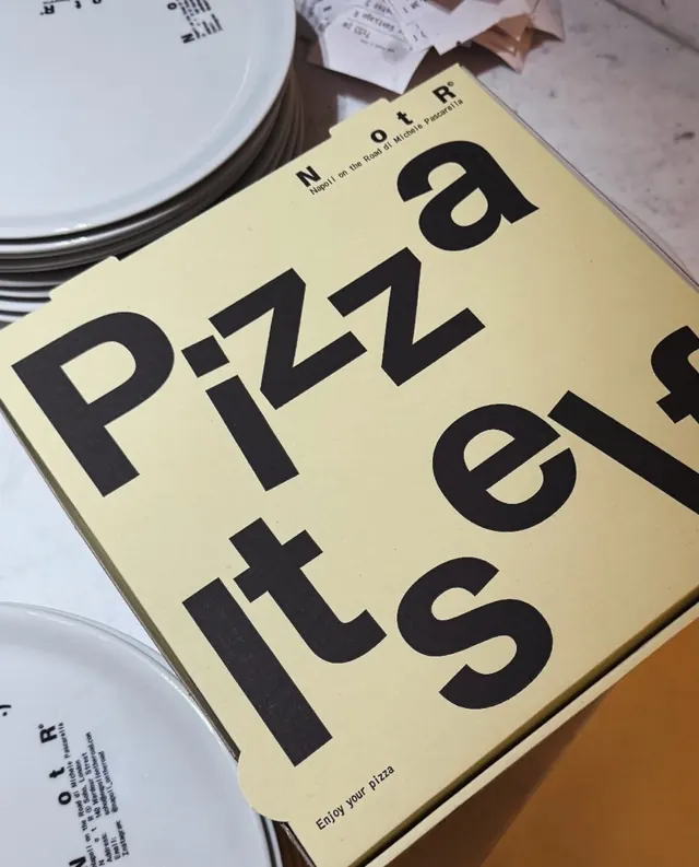
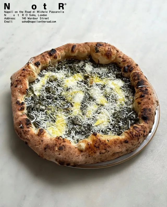
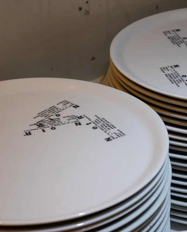
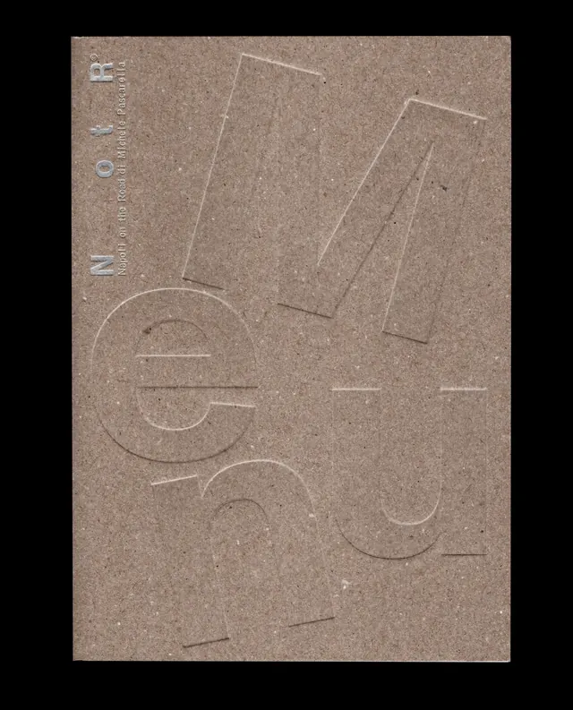
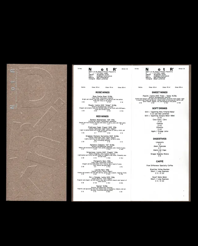
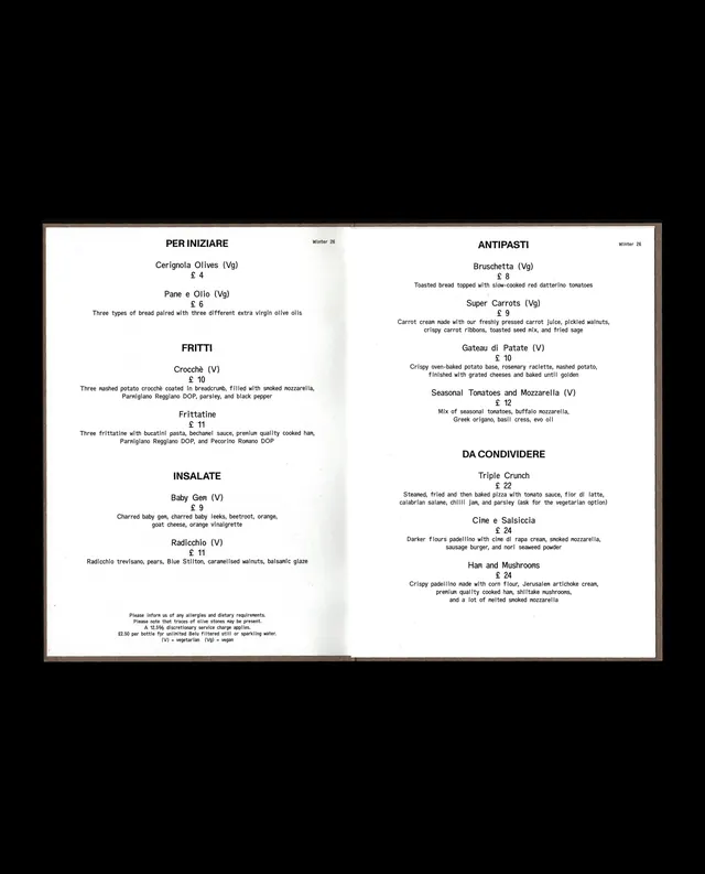
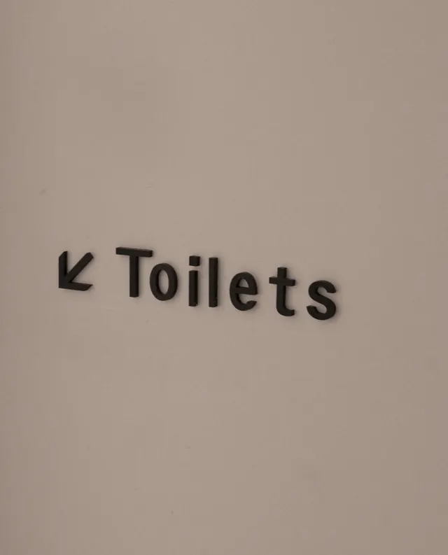
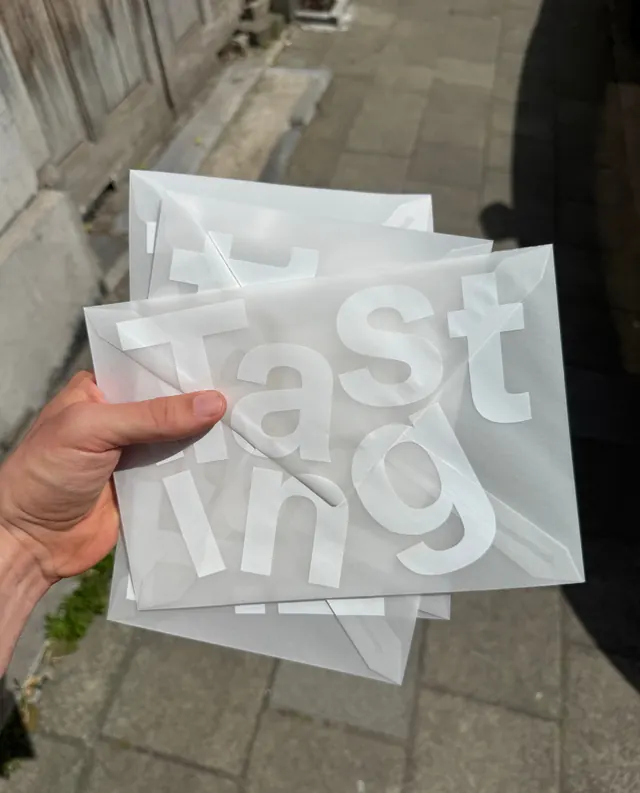
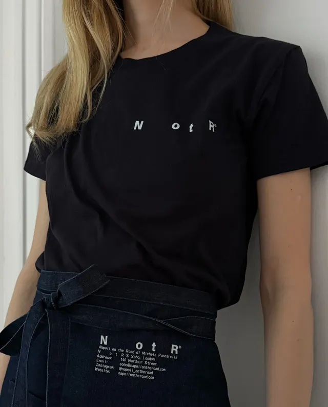
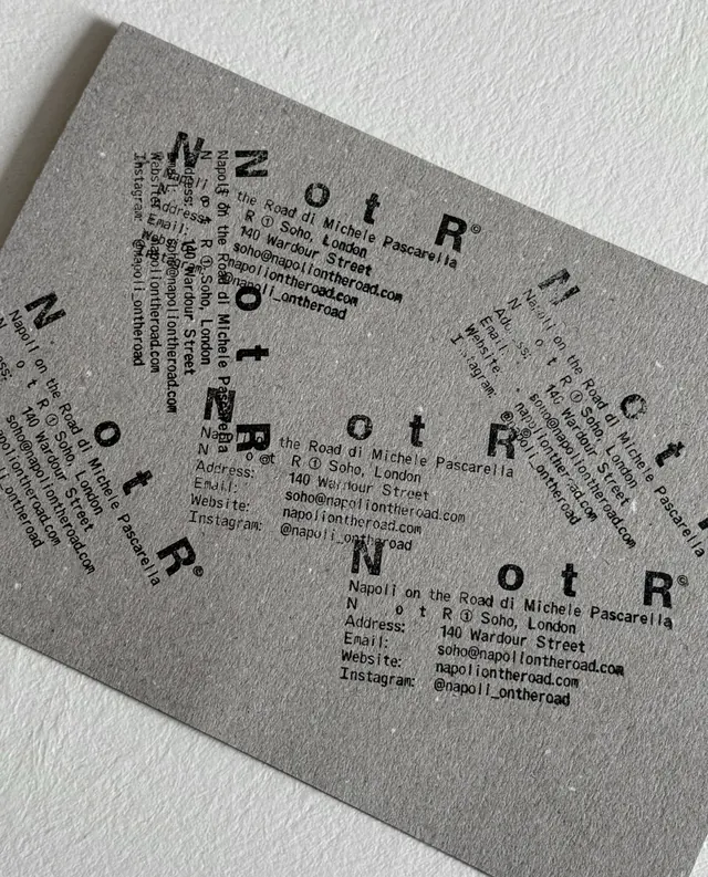
Cream or off-white background as default. Large-scale typography dominates: the fragmented wordmark appears in multiple configurations - sometimes "NotR" intact, sometimes split into "N" and "otR," sometimes rotated or arranged vertically. Thick, geometric sans-serif in black. Photography of pizza, food preparation, architectural details, and interior spaces integrated with overlaid type elements. Geometric shapes - rectangles, lines, dividers - add structure. A copyright symbol and circular registration mark appear consistently as system elements. Environmental graphics show the wordmark applied to signage, wayfinding, floor stickers, and interior architectural elements. Some slides feature warm-toned food and architectural photography against neutral backgrounds; others are pure typographic compositions.
Key takeaway
The fragmented wordmark is not a gimmick - it embodies the restaurant's fierce individuality in a saturated market. Breaking the name apart makes it impossible to miss and impossible to ignore; it signals "we're not trying to fit a mold." The clean geometry and high contrast make the fractured type read as intentional rather than accidental. The system proves you can be unconventional and still maintain coherent brand application across diverse applications.
Reuse notes
Excellent precedent for F&B, hospitality, or cultural brands seeking to stand apart through typographic boldness. The fragmented wordmark works best when backed by a genuine unconventional philosophy (as is the case here - the chef's uncompromising approach to pizza). Requires careful craftsmanship to avoid looking careless or poorly designed; the geometry must be precise even though it appears fractured. Video content in the carousel (slide 1) is key to showing how the system animates in physical space. The neutral palette (cream, black, brown) ages well and photographs well in diverse environments.
From this post: NotR Napoli on the Road hospitality branding
View post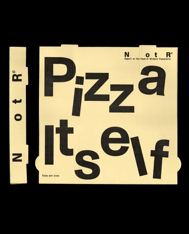
More like this




Keep what you find
A free account saves references to boards and can send you a weekly email of picks based on what you save.
To see every result, go Pro.