Preview image. Unlock full-res
Comprehensive brand identity for Veda featuring modular mark iterations, detailed icon system, and luxury product design across materials and mockups.

Summary
A luxury brand identity system for Veda featuring organic geometric mark variations, a comprehensive line-based icon set, and sophisticated application to product design and collateral materials.
Visual description
The carousel showcases a multi-slide brand case study. Monochromatic backgrounds with warm earth tones dominate. The hero mark appears as a series of iterations showing geometric refinement from organic to engineered forms, rendered in bronze and copper metallics. A full icon system uses minimal line work with consistent stroke weight. Product photography shows physical objects rendered in neutral and rose gold tones against soft backgrounds. Collateral designs display the mark and type system with generous whitespace and clear hierarchy. The cover image is a mood board capturing the brand's luxury aesthetic across product, graphic, and environmental applications.
Key takeaway
The discipline of developing a scalable mark system through visible iterations, and applying it consistently across dimensions from icon glyphs to large-scale product design. The restraint in color and the use of organic geometric forms creates premium positioning.
Reuse notes
Strong reference for luxury or minimalist brand systems. The modular mark approach works well for brands needing flexibility across applications. The metallics and warm earth palette suits beauty, jewelry, premium goods, or design-forward tech. Apply when you need to show brand evolution and versatility.
From this post: Veda brand identity system
View post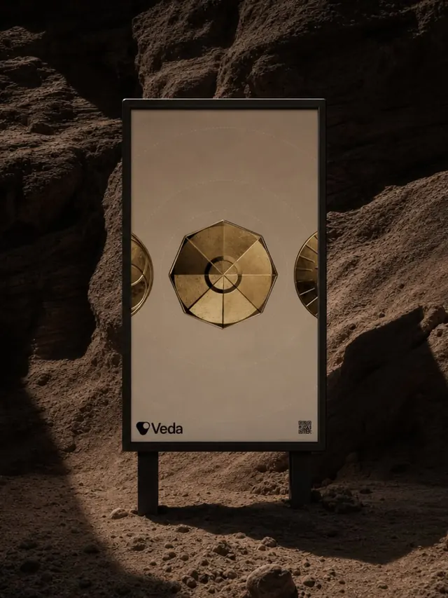
More like this


Keep what you find
A free account saves references to boards and can send you a weekly email of picks based on what you save.
To see every result, go Pro.