Preview image. Unlock full-res
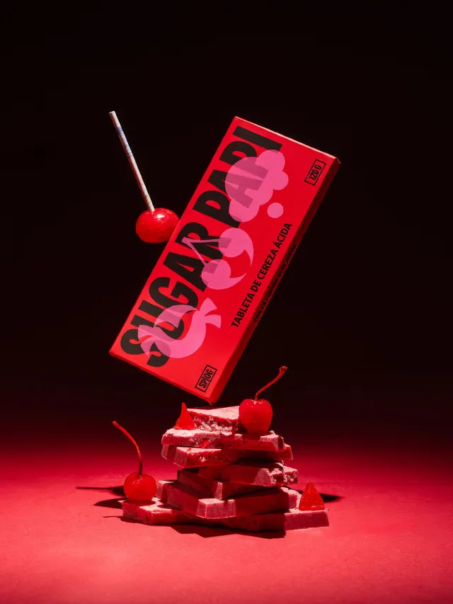
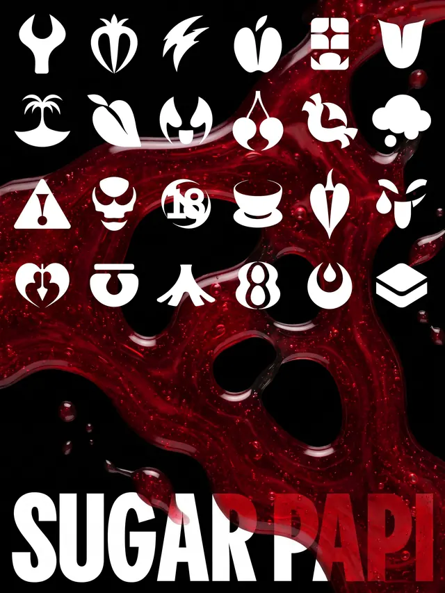
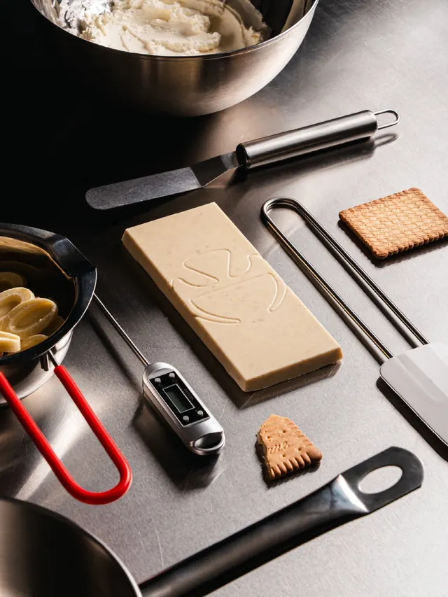
Bold, playful branding carousel for a food brand featuring vibrant red packaging, ornamental pink forms, and illustrated product styling.

Summary
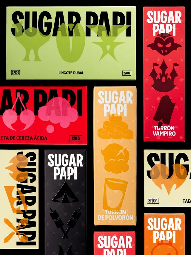
A vibrant visual identity system for Sugar Papi, a playful food brand, featuring bold red boxes, pink ornamental shapes, and dynamic product photography across a multi-slide carousel showcasing packaging, branding elements, and applications.
Visual description
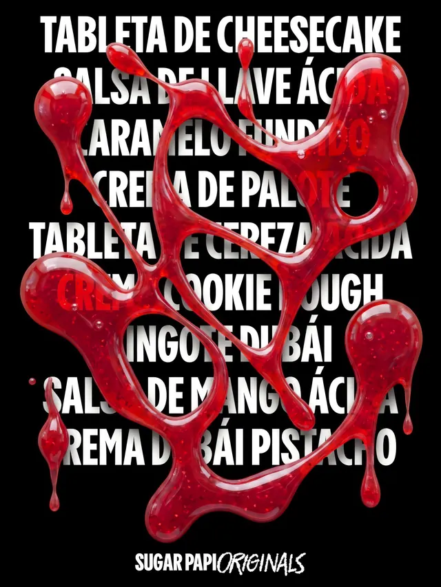
Deep black background throughout. Primary identity: bright red rectangular box with black sans-serif bold logotype reading "SUGAR PAPI" overlaid with translucent pink organic blob shapes. Bright red candy and product photographs (cherries, confections) styled against the red palette. Ornamental pink curved elements frame compositions. Typography is bold and confident, mixing structured sans-serif with flowing italic handwriting. Gradient transitions and 3D rendered product imagery appear across slides, maintaining a cohesive warm, high-contrast palette of red, black, pink, and cream.
Key takeaway
The ornamental blob shapes (repeated across slides) provide visual identity that feels playful and premium simultaneously. The bold, unflinching color palette makes the brand instantly recognizable. Strong application of branding across physical and digital touchpoints.
Reuse notes
Ideal reference for food and beverage brands seeking playful, modern identities with strong color confidence. The ornamental decorative elements can elevate brand perception from casual to refined. Works well for premium confectionery, candy, or culinary brands targeting design-conscious audiences. The dark backgrounds make colors pop effectively in digital contexts.
From this post: Sugar Papi brand identity and packaging carousel
View post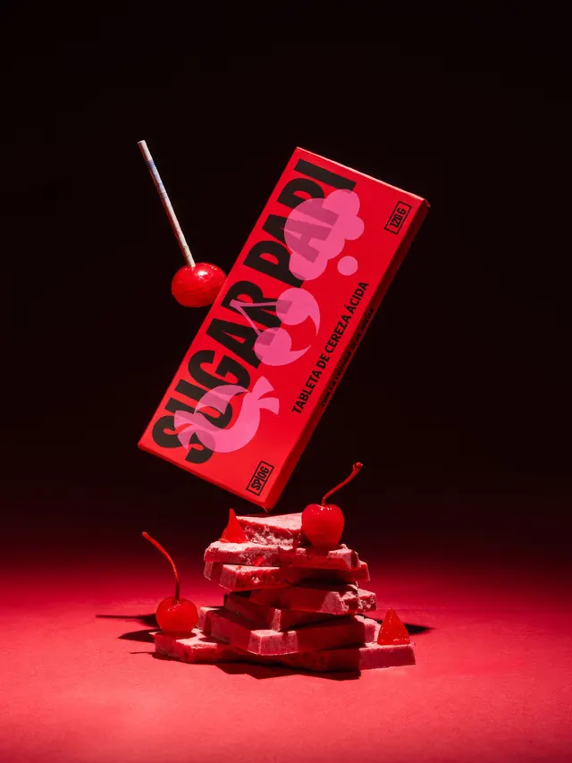

More like this


Keep what you find
A free account saves references to boards and can send you a weekly email of picks based on what you save.
To see every result, go Pro.