Preview image. Unlock full-res
A 19-slide case study documenting Akronim's visual identity refresh for MADANA, an artisan ceramic tile brand, featuring a refined geometric mark, sophisticated collateral system, and product-focused imagery across packaging, materials, and digital platforms.

Summary
Akronim's thoughtful visual refresh for MADANA Tiles, marking the company's 10-year legacy in artisan ceramic surfaces. Rather than a complete overhaul, the identity evolution preserves the heritage while introducing a more contemporary, structured graphic system and refined geometric mark, applied consistently across the full brand ecosystem.
Visual description
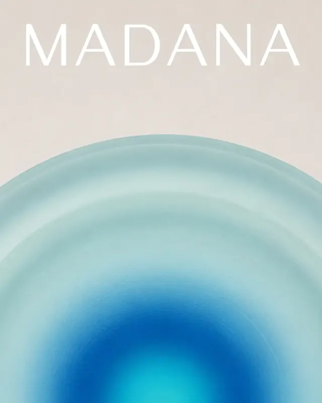
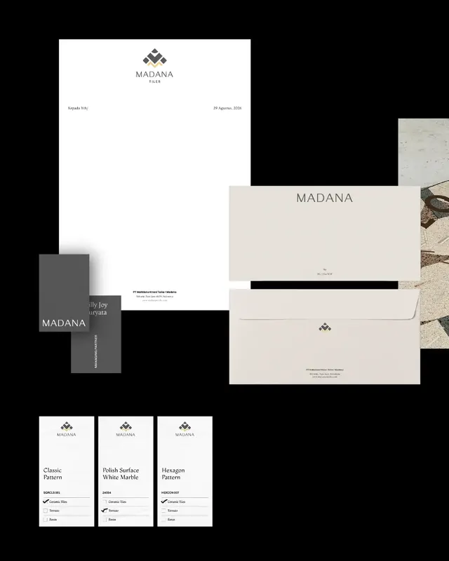
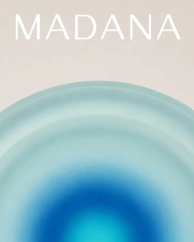
The carousel opens with the MADANA wordmark rendered in light, elegant sans-serif over a soft blue-to-teal radial gradient, establishing the premium, contemporary tone. Slide 2 introduces the refined geometric mark: a diamond-shaped tile-pattern symbol in dark gray and gold, paired with "TILES" descriptor on a warm cream background. Subsequent slides show the mark in alternate colorways (white on dark gray, dark on light) across different tonal treatments, demonstrating versatility.
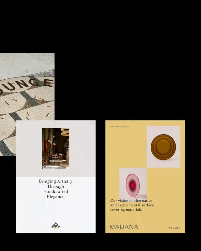
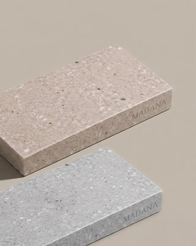
Slides 4-6 shift to the brand narrative and product focus, featuring imagery of terrazzo and ceramic surfaces with serif typography ("Bringing Artistry Through Handcrafted Elegance") and a glossy-finish ceramic tile sample with a warm orange gradient core. Slides 7-10 layer in practical applications: a black-and-white documentary photograph of handcrafting processes with gold overlay text, a systems blueprint showing the full product range (Classic Pattern, Polish Surface White Marble, Hexagon Pattern) in technical layouts, and close-up product photography of finished terrazzo tiles with embossed MADANA mark.
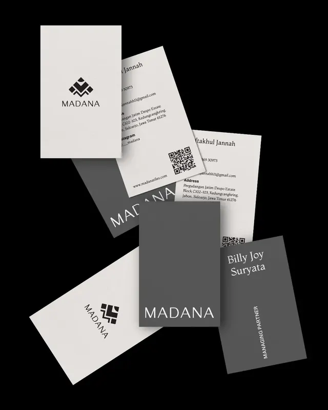
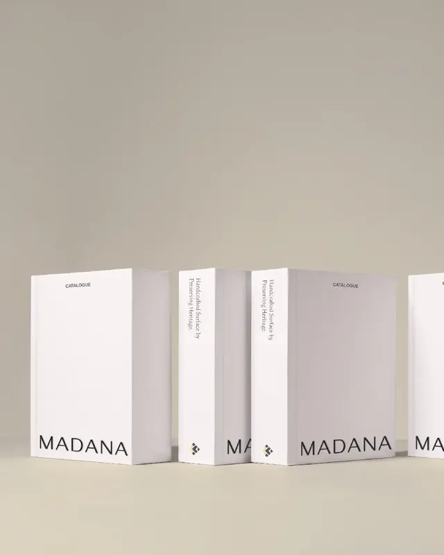
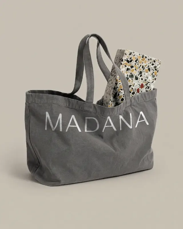
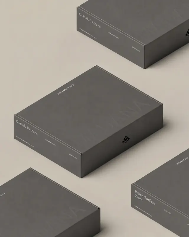
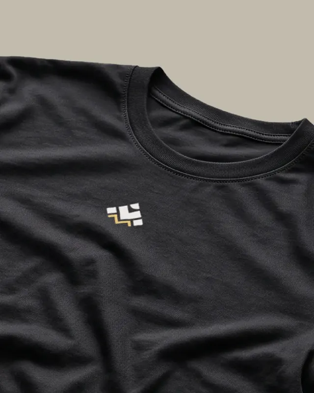
Slides 11-12 showcase collateral: a cascading arrangement of business cards in cream and dark gray colorways with QR codes, company information, and the mark; and elegant white cardboard packaging boxes labeled "CATALOGUE" with heritage descriptors on spines. Slides 13-15 expand into merchandise and apparel: a gray canvas tote with MADANA text holding patterned tile samples, isometric views of dark packaging, and a black t-shirt with a small embroidered logo detail.
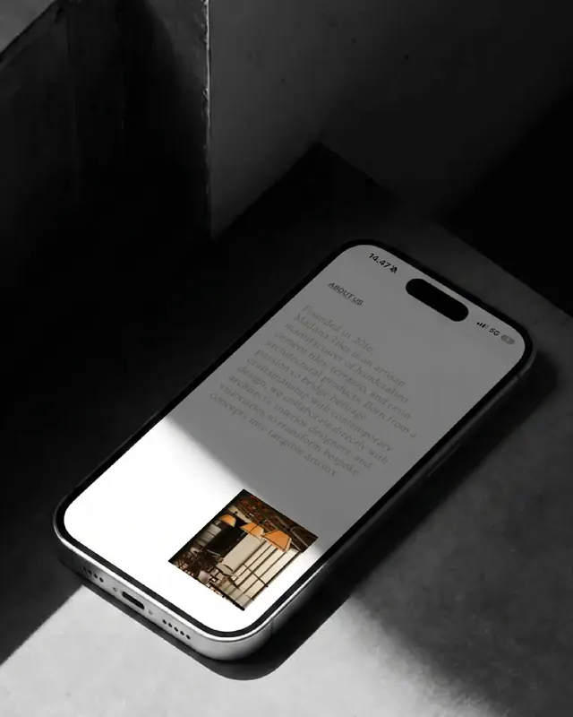
Slides 16-17 feature video content and social presence: a dark video frame with the brand tagline in gold serif typography, and screenshots of Instagram posts from @madanaworks showing product flats with colored backgrounds and customer testimonials. The final two slides present the digital presence: a website mockup showing an elegant restaurant or showroom interior featuring the geometric patterned floor tiles with the brand tagline overlaid, and a mobile phone mockup displaying the website's "About Us" page with company origin story and interior photography.
Key takeaway
The restraint and consistency of the mark itself: a simple geometric evolution that reads instantly at all scales, from business card to floor tile, without requiring the wordmark to define it. The gold accent color used sparingly throughout (business cards, tagline, social graphics) creates premium touchpoints without overwhelming the neutral palette. Pairing heritage imagery (hands, processes, archive photography) with contemporary minimalist layout and serif typefaces communicates craft authenticity without looking dated.
Reuse notes
An exemplary model for heritage brand refreshes that preserve equity while modernizing. The case study format with process imagery, product close-ups, and full-system applications is highly effective for showcasing comprehensive identity work. Works well for artisan, design, and luxury product categories. The neutral color palette and serif typography translate across both physical collateral and digital media convincingly. Note the consistent use of the geometric mark as the system anchor, allowing varied contextual treatments (photography, flat graphics, embroidery, signage) without diluting recognition.