Preview image. Unlock full-res
A comprehensive brand identity system for SecondKind, a postbiotic gut health company, blending scientific rigor with emotional design language.

Summary
A nine-slide carousel showcasing the complete SecondKind brand identity system created by BR&ING. The campaign visualizes the brand's mission around the gut-brain connection through minimal typography, scientific imagery, and a sophisticated color palette.
Visual description
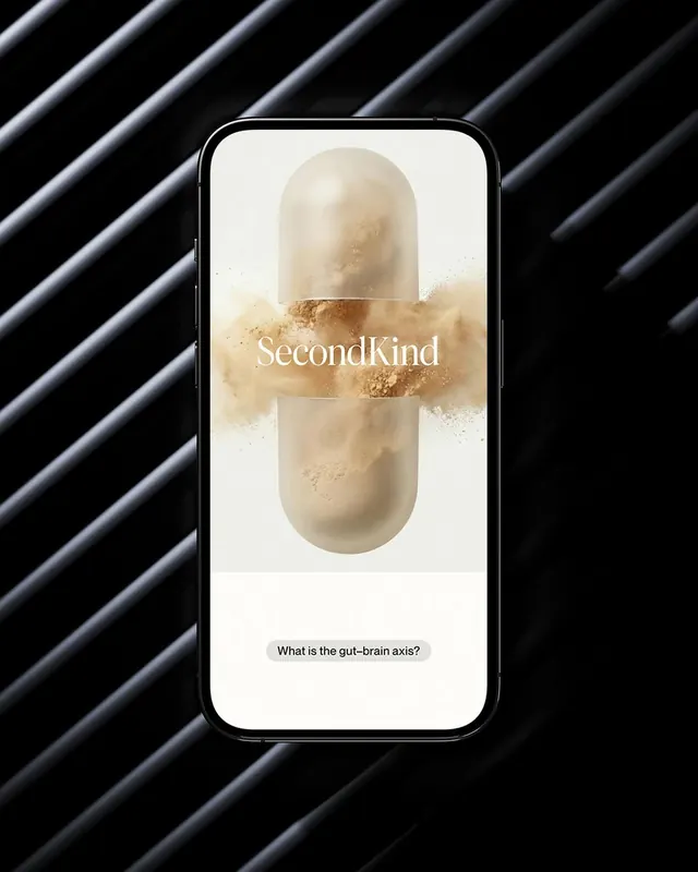
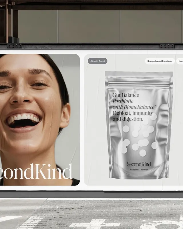
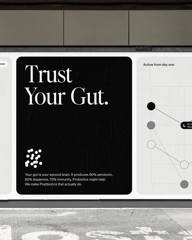
The carousel opens with the SecondKind wordmark centered in clean, modern serif typography against pure black. Subsequent slides feature detailed brand applications: scientific spheres rendered in grayscale, product packaging, brand materials, magazine spreads, and identity guidelines. Each slide is presented as motion video content with smooth transitions. The design balances clinical precision with warmth through its monochromatic palette and careful typographic hierarchy. Supporting materials include posters, promotional cards, and comprehensive brand system documentation in neutral tones.
Key takeaway
The integration of scientific visualization with luxury branding creates credibility without coldness. The exclusive use of monochrome and typography as the primary design language gives the system flexibility while maintaining a cohesive, premium appearance across all applications.
Reuse notes
Ideal for healthcare and wellness brands seeking to communicate expertise and innovation. Works well for companies bridging scientific complexity with consumer-facing messaging. The minimal approach requires exceptionally strong typography and hierarchy to anchor the visual system.