Preview image. Unlock full-res
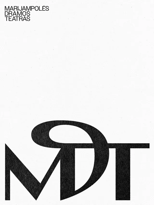
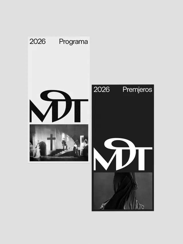
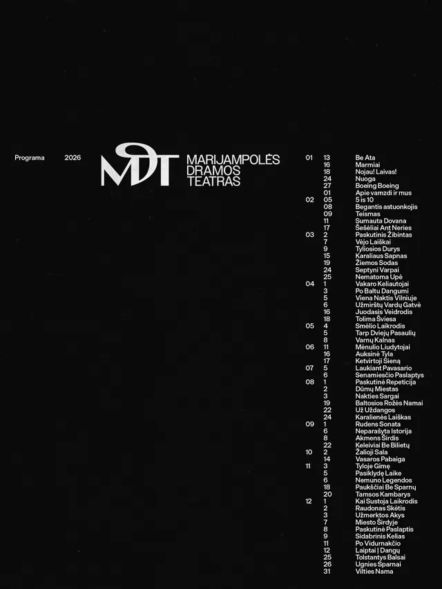
A five-slide carousel showcasing the identity redesign for Marijampolė Drama Theatre by Mykolas Saulytis, transitioning from the old logo to a sophisticated monogram system and applications.

Summary
A minimal, sophisticated monogram identity system for Marijampolė Drama Theatre by Mykolas Saulytis. Five slides present the transition from the old mark, the new geometric monogram, system variations, and applications including posters and program materials.
Visual description
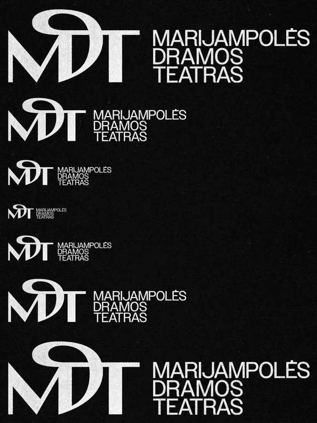
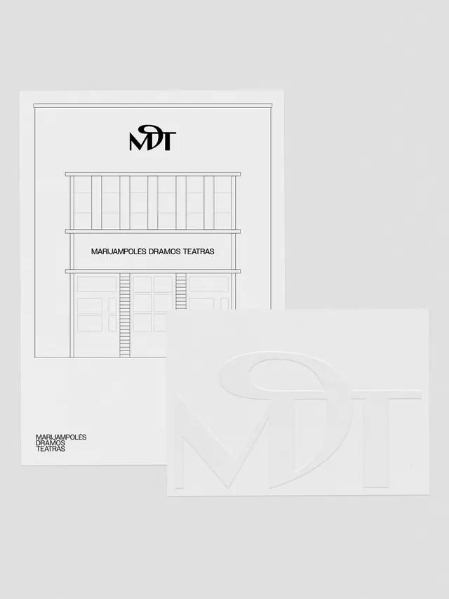
Slide 1: A vertical stacked layout presenting the new monogram-a geometric "MDT" form with sophisticated curves and clean lines in black on white. Slide 2: A grid showing the old mark alongside the new one for comparison, plus variations at different scales showing responsive proportions. Slide 3: Technical documentation of the monogram system in a grid of construction lines and proportional guides, demonstrating the geometric logic underpinning the letterforms. Slide 4: A black poster layout with the monogram and institution name "Marijampolė Drama Theatre" in a clean sans-serif, plus program information and schedule. Slide 5: Another application showing scale variations of the monogram paired with text, demonstrating the system's flexibility. All work is rendered in black and white with excellent use of negative space and geometric precision. Typography pairs the monogram with a structured sans-serif typeface.
Key takeaway
Extracting and evolving a single "most interesting element" from an old mark creates continuity while enabling a complete modernization. The geometric monogram approach gives the theatre a flexible, scalable identity that works from business cards to posters. Showing construction/proportional guides builds trust in the design's precision.
Reuse notes
Excellent case study for cultural institutions (theatres, museums, galleries) needing a refresh. The monogram approach works particularly well when the institution has a brief, memorable acronym. Swiss-inspired geometric systems scale across applications and work beautifully in black and white (cost-effective, versatile). The design-process narrative (showing the old mark and construction guides) is particularly effective on design-focused platforms and portfolios. Could inspire similar identity projects for other organizations.
From this post: Marijampolės Drama Theatre monogram redesign
View post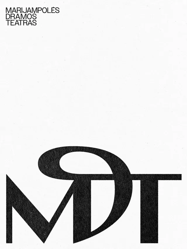
More like this


Keep what you find
A free account saves references to boards and can send you a weekly email of picks based on what you save.
To see every result, go Pro.