Preview image. Unlock full-res
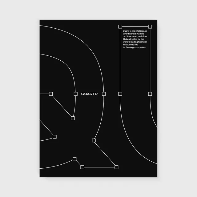
A showreel of poster designs for Quartr's brand refresh, showcasing the new logomark, custom wordmark, color palette, and typographic system applied across brand posters and merchandise.
Summary
A showreel of poster designs for Quartr's brand refresh, showcasing the new logomark, custom wordmark, color palette, and typographic system applied across brand posters and merchandise.
Visual description
A minimalist black composition featuring thin white lines that curve and connect small white square nodes. The word "QUARTR" is centered in a white sans-serif typeface, accompanied by a small block of sans-serif text in the upper right corner. The design relies on a high-contrast, monochromatic color palette and geometric abstraction.
Key takeaway
Use thin, sweeping curved lines connecting geometric nodes to create a sense of sophisticated connectivity and data flow.
Reuse notes
Reach for this as a identity system reference. Pairs with typographic, geometric directions. Original by Oliver ೫.