Preview image. Unlock full-res
Visual design inspiration: dansk atletik logo identity.
Summary
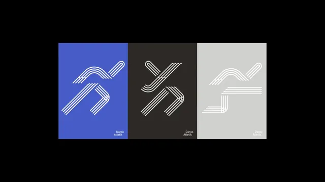
Minimal brand identity system for Danish athletic organization with striped arrow/chevron mark in primary blue, charcoal, and light backgrounds.
Visual description
Three variations of a geometric mark: parallel horizontal lines forming a stylized arrow or bent chevron shape. Shown on three backgrounds (saturated blue, dark charcoal, light gray). All versions use the same mark construction; branding text 'Dansk Atletik' small and consistent across all.
Key takeaway
Clever use of striped/layered lines to create depth in a simple form; monochromatic system allows the mark to work on any color; minimal logotype positioning is elegant and restrained.
Reuse notes
Brand identity reference; the striped technique is versatile and modern. Works for sports, tech, or any category needing a contemporary geometric look.