Preview image. Unlock full-res


Visual description
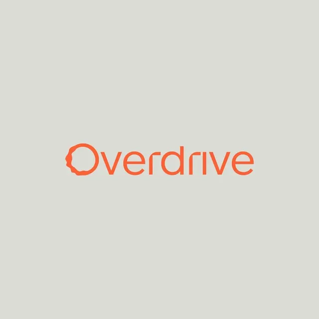
The logo consists of the word Overdrive in a sans-serif typeface. The letters are a bright orange color set against a light grey background. The capital O is stylized with a small gap and a notch on its left side.
Key takeaway
Use a subtle geometric cutout or gap in a single letter to create a distinct brand mark within a wordmark.
Reuse notes
Reach for this when designing a wordmark for e-commerce & dtc, tech. Pairs with modern, friendly identity systems. Original by Jack Janiczak.
TypeSans Serif
MoodProfessional, Friendly, Energetic, Bold