Preview image. Unlock full-res
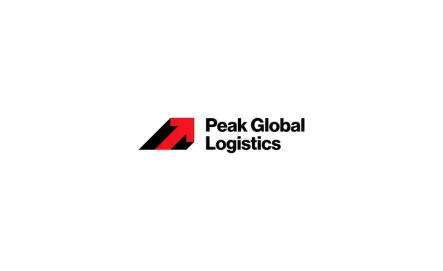
Modern logistics brand with a geometric arrow symbol in red and black, paired with bold sans-serif wordmark emphasizing upward growth and movement.
Summary
Modern logistics brand with a geometric arrow symbol in red and black, paired with bold sans-serif wordmark emphasizing upward growth and movement.
Visual description
A red upward-pointing arrow is integrated into a black geometric shape that resembles a stylized mountain or peak. To the right, the words Peak Global Logistics are written in a bold, black sans-serif typeface. The logo is set against a plain white background.
Key takeaway
Use negative space within a geometric shape to create a secondary symbol, such as an arrow, to imply direction and growth.
Reuse notes
Reach for this when designing a logo for industrial, fintech. Pairs with corporate, bold identity systems. Original by RD Farhad.