Preview image. Unlock full-res
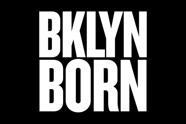
A bold, sans-serif wordmark spelling BROOKLYN BORN in white type on a black background, with a horizontal dividing line.
Summary
A minimalist wordmark design for Brooklyn Born featuring bold, all-caps sans-serif type with a geometric horizontal dividing line separating the two words.
Visual description
Two stacked lines of bold, condensed sans-serif type in white against a solid black background. The word "BROOKLYN" sits on top, with a thin white horizontal line underneath, followed by "BORN" below. The letterforms are geometric and strong, with generous spacing. The composition is centered and perfectly symmetrical. The high contrast and clean simplicity create a modern, professional appearance.
Key takeaway
A simple geometric wordmark with clear visual hierarchy can establish strong brand identity through typography alone. The horizontal dividing line adds subtle compositional interest without unnecessary complexity.
Reuse notes
Excellent reference for minimal brand identity design, wayfinding systems, or any project requiring a confident, geometric wordmark. The clean, high-contrast approach works well for urban brands, real estate, or professional services.