Preview image. Unlock full-res
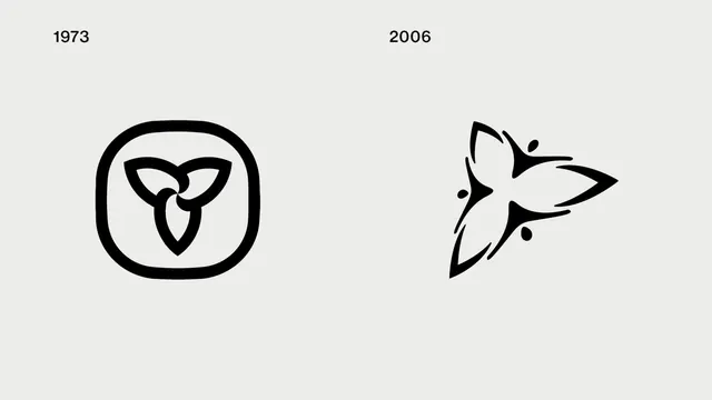
Side-by-side comparison of a 1973 three-fold knot mark in a rounded square versus a flowing 2006 bird or flame shape.
Summary
A branded before-and-after showing how a 1973 geometric trinity knot mark evolved into a 2006 liquid, wing-like abstraction—a case study in modernizing and softening a legacy symbol.
Visual description
The left half shows a heavy-stroked, three-part interlocking knot inside a rounded rectangle frame, pure black line-work on a light grey background. The right half shows a single organic form—part bird wing, part flame—with tapered, flowing lines and negative space, also in black. Both marks have a sense of movement and balance; the transition from rigid geometry to fluid modernism is stark and clear.
Key takeaway
How to recognize a logo evolution or brand refresh: the core symbolic idea (three-fold or flowing motion) survives the update, but the execution shifts from ornamental complexity to contemporary simplicity. Removing the box and adding organic curves makes the mark feel fresher without losing its meaning.
Reuse notes
Use as reference for heritage brand redesigns or when showing the progression from traditional to contemporary mark-making. Works well alongside other logo histories to demonstrate twentieth-century design trends: structure → fluidity, ornamentation → reduction. The side-by-side format is clear and educational.