Preview image. Unlock full-res
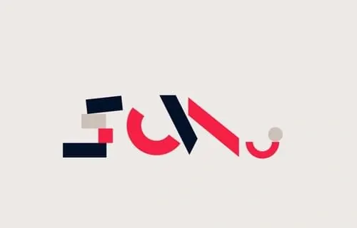
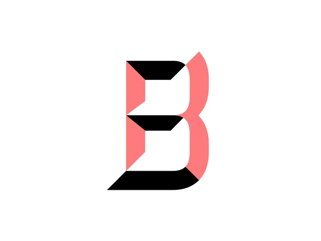
A bold, minimalist lettermark "B" composed of interlocking coral and black geometric shapes with a clean, modern aesthetic.
Summary
A minimalist geometric lettermark consisting of interlocking coral/pink and black shapes that form the letter "B" on a clean white background.
Visual description
The mark is constructed from three main geometric units: a solid black parallelogram at top, coral-colored left and right angular panels framing it, and matching black and coral shapes stacked below. The overall construction creates a modern, slightly isometric feel through the use of parallel sides and angular cuts. The color palette uses vibrant coral (possibly palette: #FF6B7A or nearby) paired with solid black shapes, creating maximum contrast. The proportions are nearly square, with the letterform centered and symmetrical.
Key takeaway
The use of simple geometric components stacked and interlocked to form a recognizable letter—a modular, scalable approach that works at any size. The two-color system (vibrant accent + black + white) provides instant visual hierarchy and modern energy.
Reuse notes
Ideal for tech, creative, or modern brands seeking a distinctive mark with strong geometric integrity. The design is flexible enough to work as an icon, favicon, or large-format application. Works equally well in grayscale or in its full color version. The angular cut-and-stack approach suggests potential for animation or variation.