Preview image. Unlock full-res
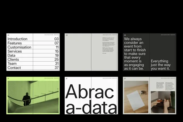
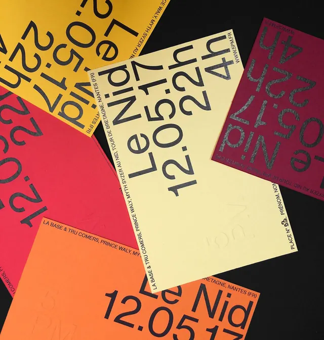
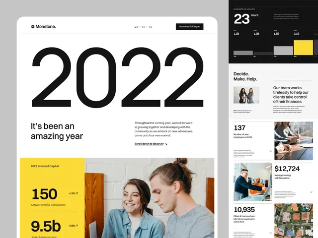
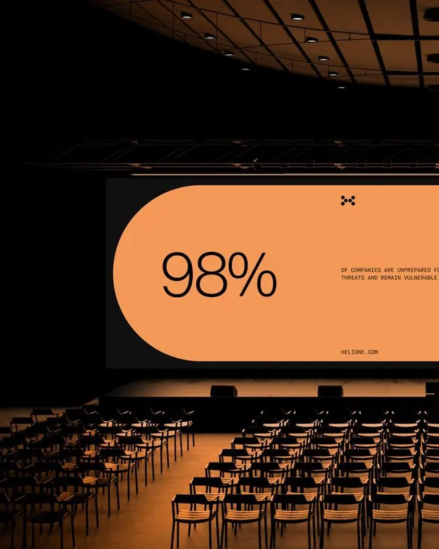
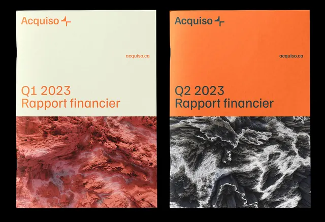
This design uses a striking color contrast between warm earth tones (terracotta/orange) and neutral creams, emphasizing texture through photographic elements.
Summary
This design uses a striking color contrast between warm earth tones (terracotta/orange) and neutral creams, emphasizing texture through photographic elements.
Visual description
This design uses a striking color contrast between warm earth tones (terracotta/orange) and neutral creams, emphasizing texture through photographic elements. The visual language is clean yet rugged, effectively conveying professionalism and depth in financial reporting. The composition employs a clear split layout, juxtaposing distinct photographic textures within contrasting color fields to segment different reporting periods. clean, modern sans-serif fonts used for high legibility and a strong corporate feel.
Key takeaway
An editorial spread reference. Worth saving for its minimalist, textured, corporate treatment.
Reuse notes
Fits fintech, analytics work.