Preview image. Unlock full-res
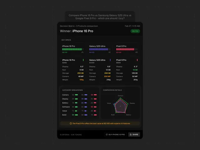
This graphic employs a clean, data-driven visual language typical of modern tech comparison tools.
Summary
This graphic employs a clean, data-driven visual language typical of modern tech comparison tools.
Visual description
This graphic employs a clean, data-driven visual language typical of modern tech comparison tools. It uses a dark background contrasted with vibrant accent colors to clearly present complex feature data in an organized, structured matrix. The overall feel is precise, analytical, and highly informative. The composition is highly structured, utilizing a grid system and bar charts to create clear hierarchy between product metrics and performance scores. clean sans-serif fonts typical of user interface design are used throughout for readability.
Key takeaway
An infographic reference. Worth saving for its data visualization, infographic, dark mode treatment.
Reuse notes
Fits general design work.
More like this
Keep what you find
A free account saves references to boards and can send you a weekly email of picks based on what you save.
To see every result, go Pro.