Preview image. Unlock full-res
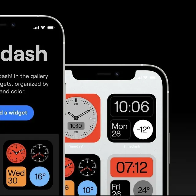
iPhone device mockup for Timedash, an iOS widget app displaying analog clock, digital time, date, and temperature widgets in a mixed light/dark color system with bold orange accents.
Summary
iPhone device mockup for Timedash, an iOS home-screen widget app, showing a grid of analog clock and digital time/weather widgets in black, white, and bold orange, presented across a dark and a light phone side by side.
Visual description
Two iPhone frames on a near-black background, slightly overlapping. The left phone (cropped, dark screen) shows a 2x2 widget grid: an analog clock on a red-orange square, a second analog clock on white, a date widget reading "Wed 30" on orange, and a temperature widget reading "16 degrees" on blue. The right phone (silver frame, light background) occupies the foreground and shows three rows of widgets: a large 2x1 analog clock on white with a red-orange background, a 1x1 digital clock reading "10:06" in bold on black, a date/day cell "Mon 28" and a temperature pill "-12 degrees" in white circle on gray. Below those, a 2x1 orange pill showing "07:12" in oversized display digits, and two smaller weather widgets for Fri/Sat with temperatures on gray and white rounded-rectangle backgrounds. The app name "Timedash" appears in white sans-serif on the dark background beside the product name.
Key takeaway
The widget-grid layout shows how a small set of colors (black, white, orange, gray) applied to rounded-rectangle tiles can carry multiple distinct information types (time, date, temperature) while feeling visually unified. The orange accent does double duty as both a color-coded type indicator and a high-contrast background for legibility. The side-by-side dark/light phone presentation efficiently communicates theme support without a separate screenshot.
Reuse notes
Useful reference for iOS widget UI design, home-screen customization apps, and product marketing shots for mobile utilities. The widget-grid pattern also translates well to web dashboard cards and smartwatch face designs. Orange-on-black contrast is excellent for at-a-glance readability at small sizes.