Preview image. Unlock full-res
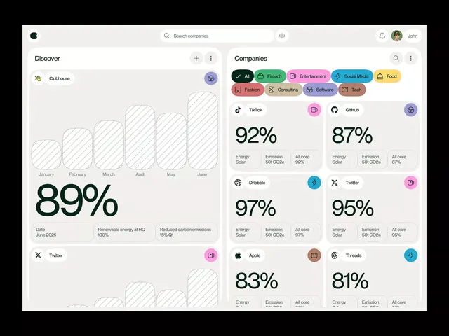
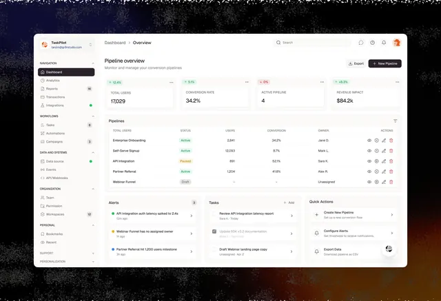
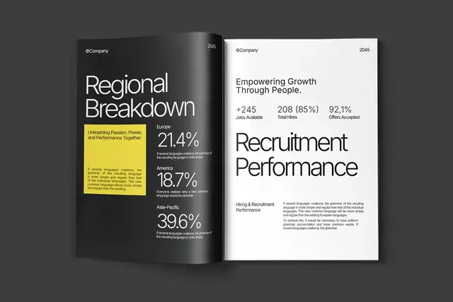
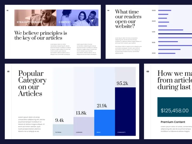
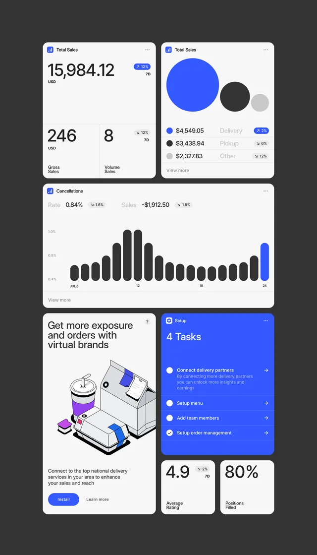
This is a clean, data-driven visualization designed for professional reporting, utilizing a minimalist approach to present performance metrics clearly.
Summary
This is a clean, data-driven visualization designed for professional reporting, utilizing a minimalist approach to present performance metrics clearly.
Visual description
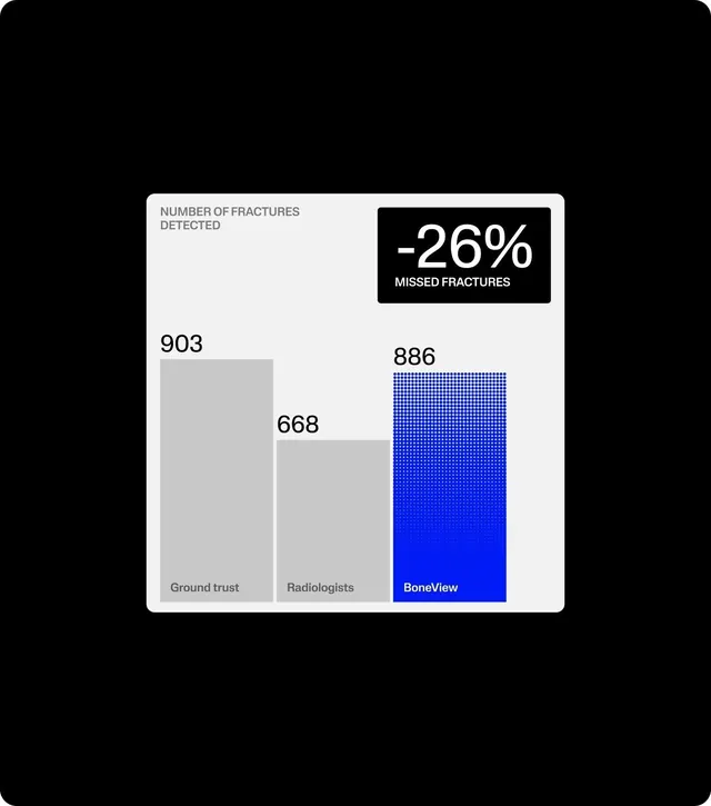
This is a clean, data-driven visualization designed for professional reporting, utilizing a minimalist approach to present performance metrics clearly. The design focuses heavily on hierarchy, making the percentage loss immediately apparent through contrasting text and bar charts. The composition is structured vertically, using a clear card format to organize statistics and bar charts against a dark background. Clean, legible sans-serif fonts are used throughout to ensure high readability for numerical data.
Key takeaway
A dashboard reference. Worth saving for its data-visualization, minimalist, professional treatment.
Reuse notes
Fits healthcare, analytics work.