Preview image. Unlock full-res
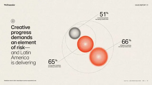
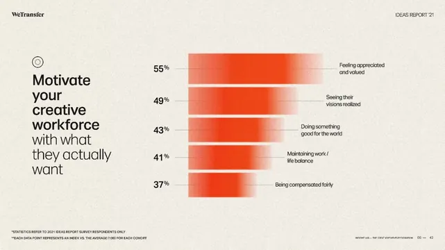
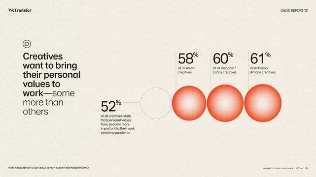
The design uses a clean, minimalist layout dominated by a progression of large, monochromatic spheres to visually represent survey responses.
Summary
The design uses a clean, minimalist layout dominated by a progression of large, monochromatic spheres to visually represent survey responses.
Visual description
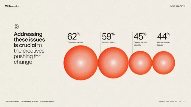
The design uses a clean, minimalist layout dominated by a progression of large, monochromatic spheres to visually represent survey responses. The visual language is direct and data-driven, employing a subtle gradient or shading on the spheres to add depth against a neutral background. The composition is linear and horizontal, using a sequence of equally sized circles to display percentage data across the frame. Sans-serif typeface is used for titles and labels, appearing clean and highly legible.
Key takeaway
A data viz reference. Worth saving for its minimalist, data visualization, modern treatment.
Reuse notes
Fits general design work.