Preview image. Unlock full-res
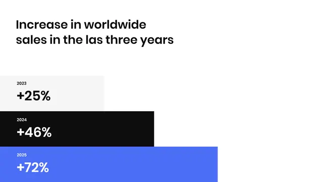
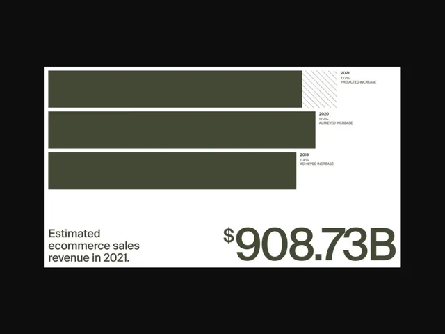
This is a highly professional and minimalist data visualization designed for a business presentation.
Summary
This is a highly professional and minimalist data visualization designed for a business presentation.
Visual description
This is a highly professional and minimalist data visualization designed for a business presentation. The design uses strong contrast between black, white, and blue to clearly highlight increasing growth metrics across three years. The visual language is clean, analytical, and focused purely on conveying quantitative results effectively. The composition is a simple, structured vertical timeline utilizing stacked bar segments to show progressive numerical increase. Clean, modern sans-serif typeface typical of corporate presentation slides.
Key takeaway
An infographic reference. Worth saving for its minimalist, data visualization, corporate treatment.
Reuse notes
Fits b2b, fintech, analytics work.
More like this
Keep what you find
A free account saves references to boards and can send you a weekly email of picks based on what you save.
To see every result, go Pro.