Preview image. Unlock full-res
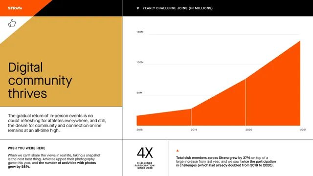
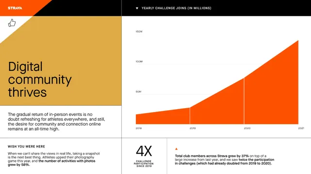
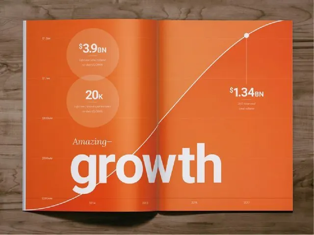
This is a clean, professional data visualization using an area chart to illustrate positive growth in community engagement metrics over time.
Summary
This is a clean, professional data visualization using an area chart to illustrate positive growth in community engagement metrics over time.
Visual description
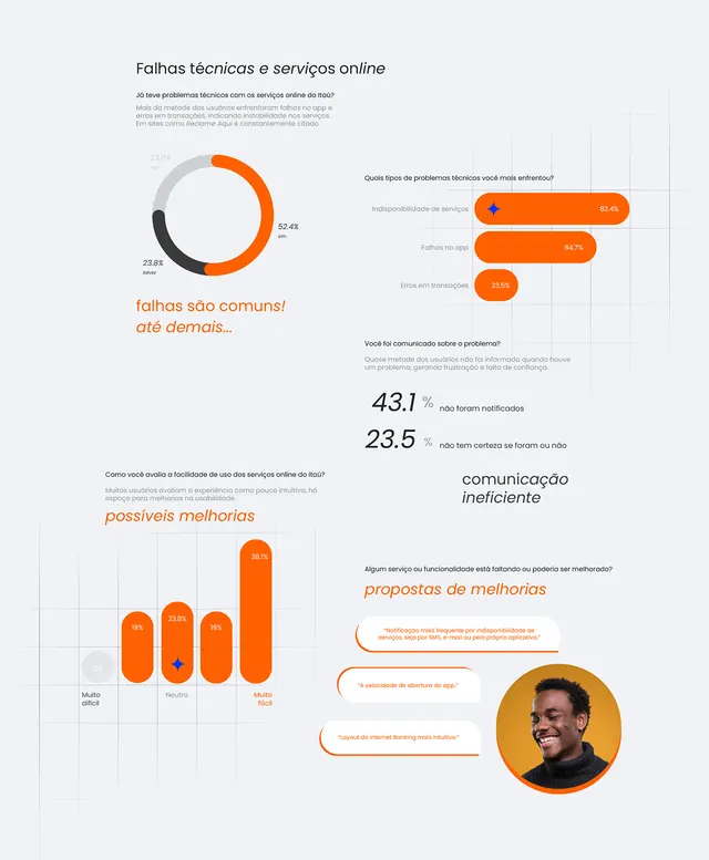
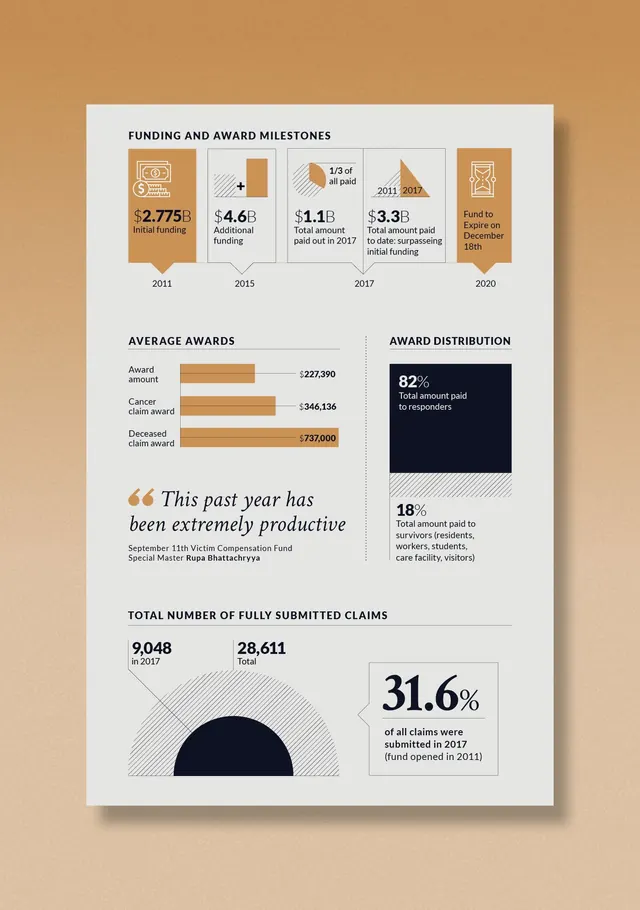
This is a clean, professional data visualization using an area chart to illustrate positive growth in community engagement metrics over time. The design effectively uses a limited, warm color palette and clear typography to convey information rapidly and credibly. The composition uses a clear left-to-right flow, positioning the brand logo and title above a prominent growth chart supported by accompanying text. Sans-serif fonts are used throughout, emphasizing readability and a contemporary feel.
Key takeaway
An infographic reference. Worth saving for its data visualization, infographic, minimalist treatment.
Reuse notes
Fits analytics work.
More like this
Keep what you find
A free account saves references to boards and can send you a weekly email of picks based on what you save.
To see every result, go Pro.