Preview image. Unlock full-res
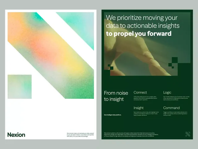
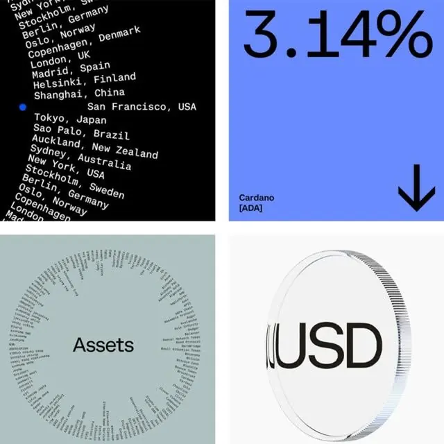
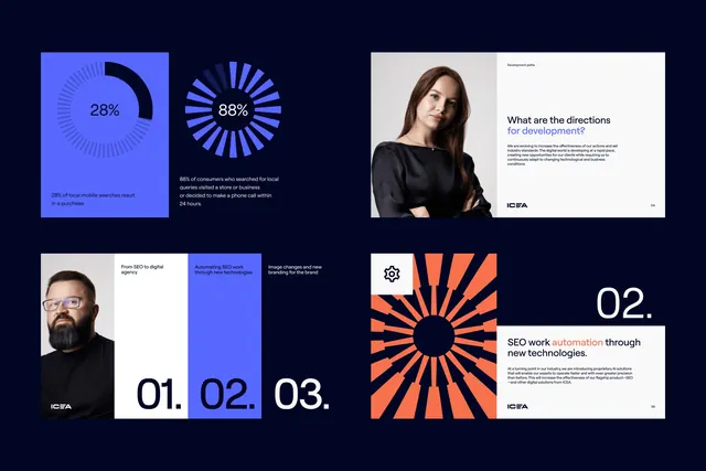
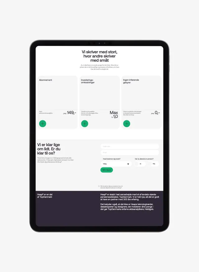
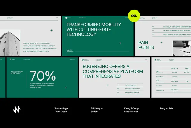
This presentation uses a clean, minimalist design anchored by geometric nodes and solid colors to illustrate abstract concepts.
Summary
This presentation uses a clean, minimalist design anchored by geometric nodes and solid colors to illustrate abstract concepts.
Visual description
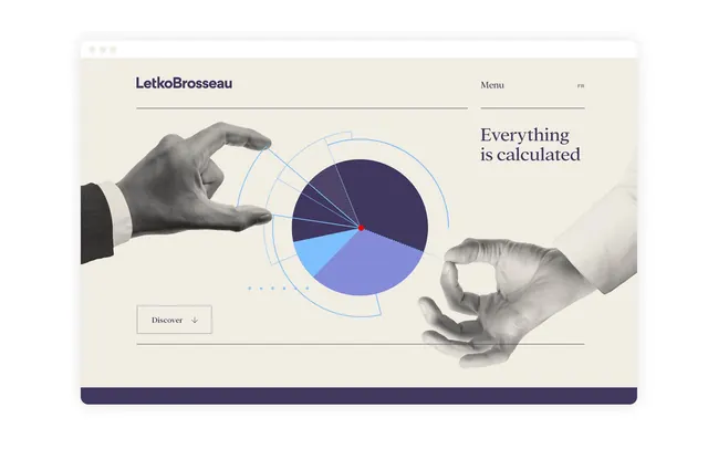
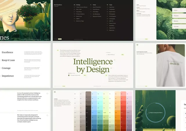
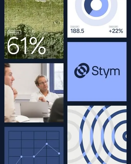
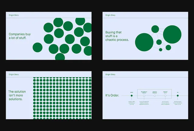
This presentation uses a clean, minimalist design anchored by geometric nodes and solid colors to illustrate abstract concepts. The visual language effectively contrasts chaotic processes with structured solutions, making complex ideas easy to digest and visualize. The layout employs a clear panel structure, using negative space effectively and relying on the contrast between dense clusters of circles to communicate different levels of complexity. clean sans-serif fonts are used throughout, prioritizing readability and a modern, professional feel.
Key takeaway
A data viz reference. Worth saving for its minimalist, data visualization, geometric treatment.
Reuse notes
Fits saas, fintech work.