Preview image. Unlock full-res
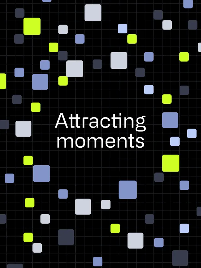
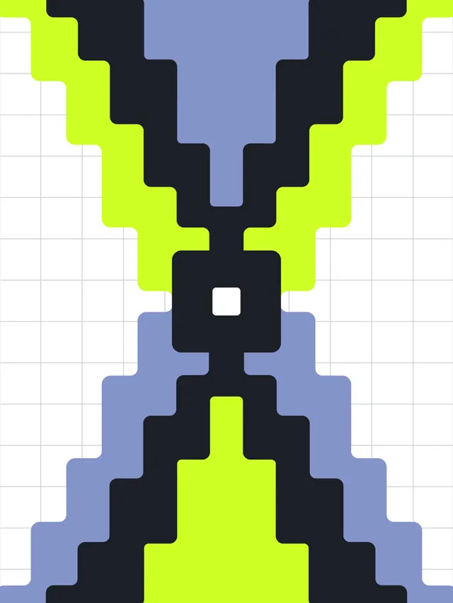
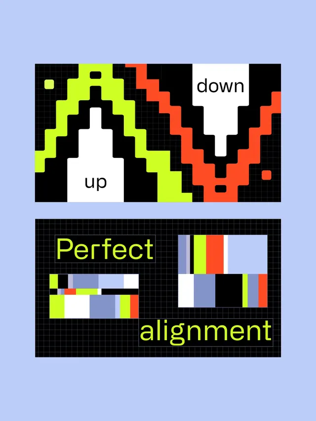
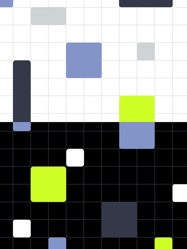
A carousel of animated motion design styleframes combining 2D and 3D techniques to illustrate growth and data visualization concepts.

Summary
A collection of animated styleframes mixing 2D and hybrid 3D techniques to explore data visualization and growth concepts, employing bold neon accent colors on dark backgrounds.
Visual description
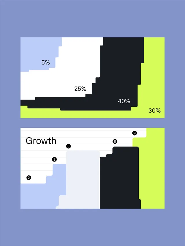
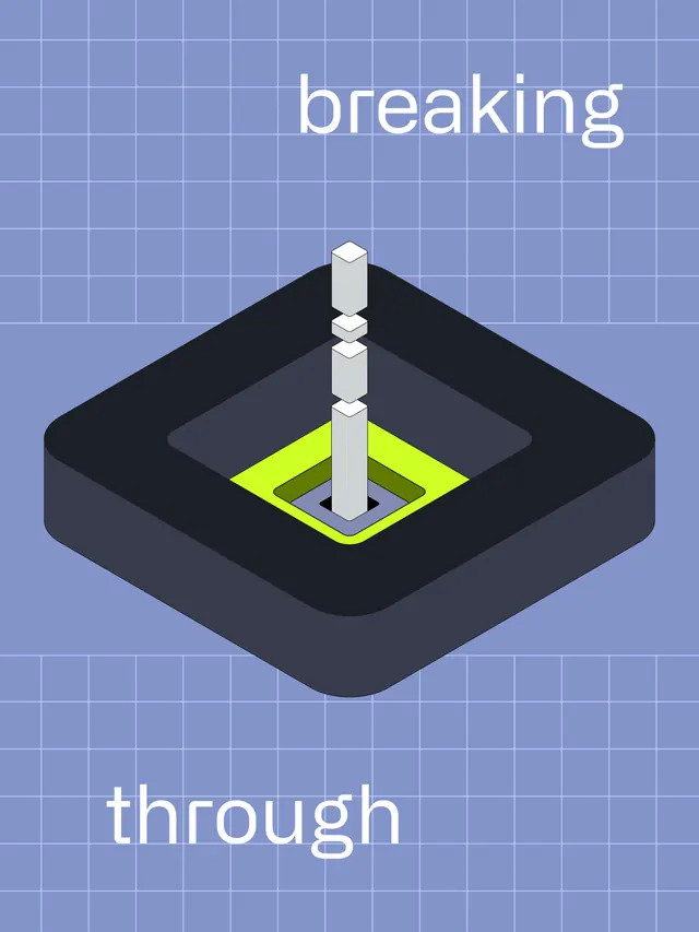
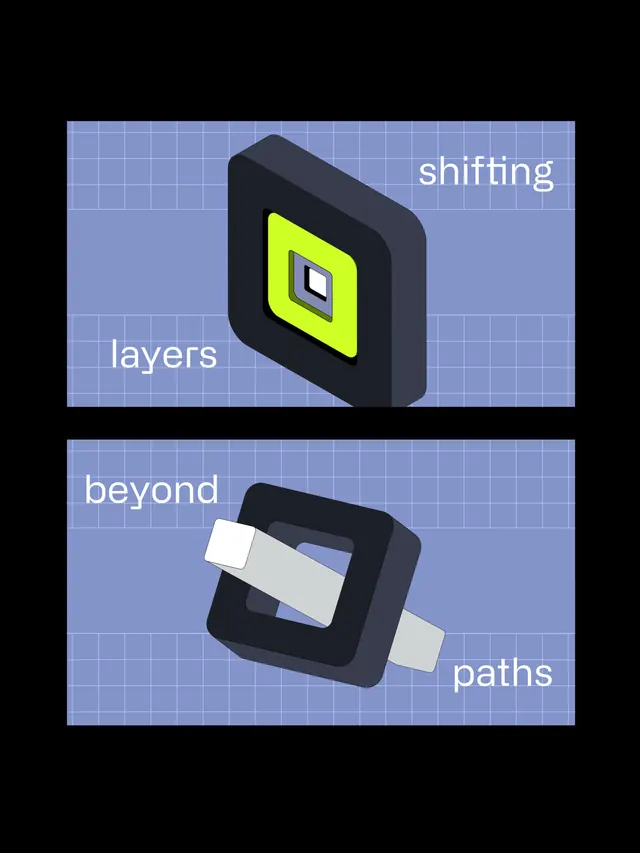
The carousel shows multiple motion design compositions, each built on a simple grid and dark background. Early frames feature isometric or pixel-art geometric shapes in neon yellow, ice-blue, and white, arranged in symmetrical patterns against black. Later slides introduce data visualization elements: a segmented area chart with percentage labels (5%, 25%, 40%, 30%) in muted and bright colors, and a growth diagram with numbered steps (2-9) plotted on an axis. The typography is technical monospace or clean sans-serif, set in black and white with minimal styling. One slide has text overlays reading "breaking through," "shifting layers beyond paths," and "attracting moments." The overall aesthetic blends the precision of technical diagrams with the vibrancy of modern motion design, using the stark contrast between pure black backgrounds and neon highlights to create visual pop.
Key takeaway
The combination of restrained, geometric shapes with strategic neon coloring creates dramatic visual impact without complexity. Breaking down motion sequences into clear styleframes demonstrates concept before full animation, useful for client communication. The mix of 2D and subtle 3D depth adds dimensionality while maintaining readability.
Reuse notes
Ideal for data-heavy presentations, financial or analytics dashboards, educational content, or corporate communications that need energy and modernity. The neon-on-black approach works exceptionally well for tech, fintech, and AI-adjacent industries. The styleframe methodology is valuable for design teams planning motion work, even if the final execution differs. Caution: high-saturation neon can be fatiguing in long-form content, so use strategically for moments that need emphasis. The geometric aesthetic may feel dated in 2-3 years as design trends shift.
From this post: Styleframes: motion design infographic series
View post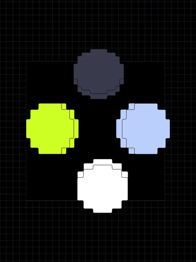
More like this

Keep what you find
A free account saves references to boards and can send you a weekly email of picks based on what you save.
To see every result, go Pro.