Preview image. Unlock full-res
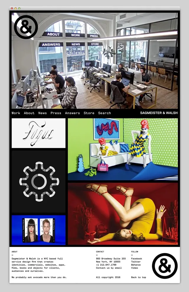
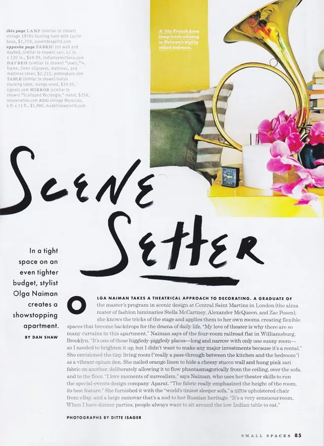
A multi-panel website interface showcasing a diverse portfolio through a grid-based layout containing office photography, stylized fashion photography, and graphic icons.
Summary
A multi-panel website interface showcasing a diverse portfolio through a grid-based layout containing office photography, stylized fashion photography, and graphic icons.
Visual description
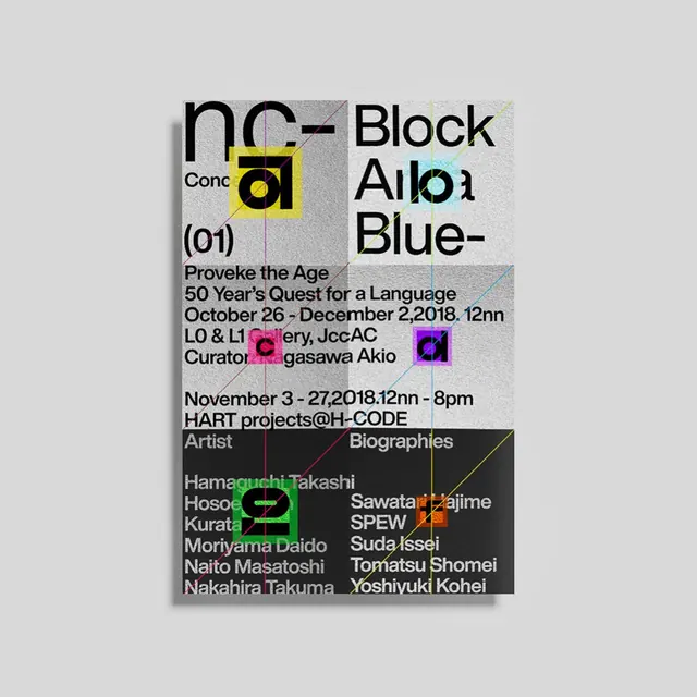
The layout uses a rigid grid to organize disparate elements including an office workspace photo, a stylized fashion shoot with bright colors, and a gear icon. It features high-contrast typography like the handwritten 'Fugue' and bold sans-serif navigation menus. The color palette shifts dramatically between the natural tones of the office and the vibrant yellows and blues of the fashion imagery.
Key takeaway
Use a diverse grid system to showcase varied project styles within a single cohesive brand identity.
Reuse notes
Use this when building a creative agency portfolio that needs to demonstrate versatility across different media and aesthetics.
More like this
Keep what you find
A free account saves references to boards and can send you a weekly email of picks based on what you save.
To see every result, go Pro.