Preview image. Unlock full-res
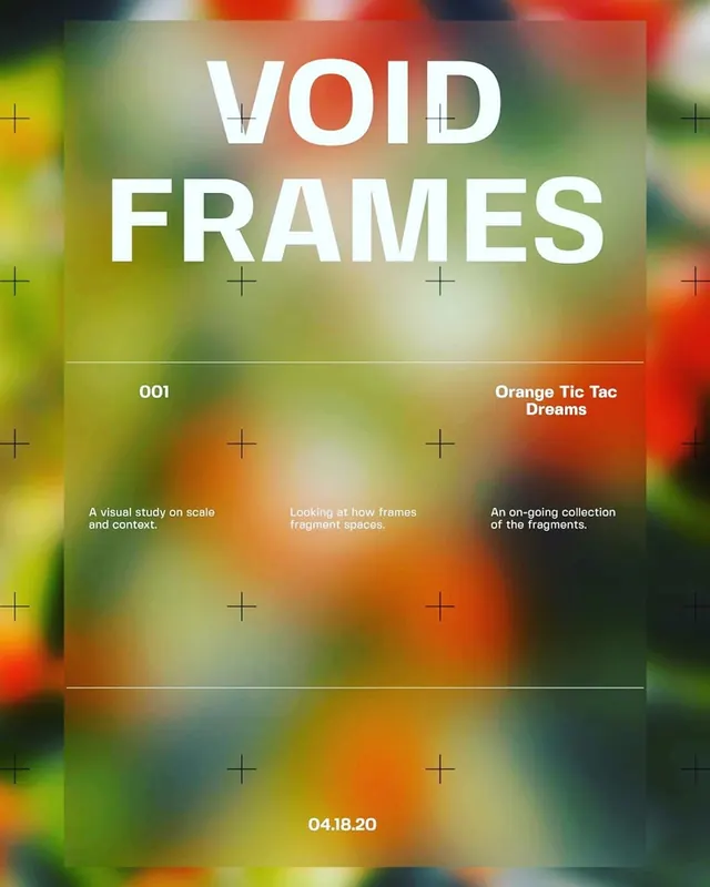
Vibrant typographic layout with bold sans-serif headline overlaid on a blurred multicolor gradient background, featuring grid annotations and layered design elements.

Summary
A layered typographic poster featuring bold oversized type layered over a heavily blurred multicolor gradient, with grid annotations and structured layout breaking the chaos into readable zones.
Visual description
A blurred background in warm yellows, oranges, reds, and cool greens and purples dominates the composition. Over this gradient sits a grid of small plus (+) symbols in white and light green, creating visual rhythm. Bold white sans-serif type reading "VOID FRAMES" anchors the upper half, with subtitle text in white below. Additional layered text in white reads "001" and "Orange Tic Tac Dreams," with supporting descriptive copy in white. Thin white dividing lines separate information zones. A date reads "04.18.20" at the bottom. The overall effect balances chaos (the gradient) with order (the grid, type hierarchy, dividing lines).
Key takeaway
Using a blurred, colorful gradient as a dynamic background texture while maintaining legibility through strong typographic hierarchy and geometric grid overlays. The contrast between structured text and chaotic backdrop creates visual interest and draws the eye to information. Small decorative elements (plus signs, dividers) add rhythm without overwhelming.
Reuse notes
Ideal for event posters, creative portfolios, or design-forward editorial layouts that want to convey energy and innovation. Works well for music, art, or tech initiatives. Pairs well with bold sans-serif headlines and requires careful contrast testing to ensure all text remains legible over the gradient. Can feel overwhelming on smaller screens; test responsiveness.