Preview image. Unlock full-res
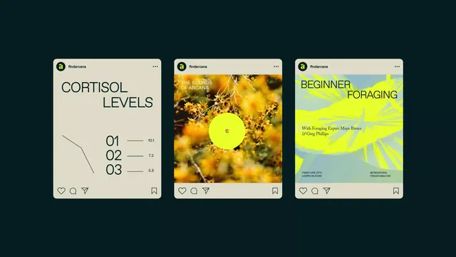
A three-up social card mockup for the brand findarcana showing three distinct content formats -- data infographic, full-bleed photo with vinyl, and neon event poster -- unified by a shared layout shell.
Summary
A three-panel social card system for the brand findarcana demonstrating how a single Instagram-style shell adapts across three content types: sparse data chart, full-bleed nature photo with a centered vinyl disc, and a high-energy neon event poster.
Visual description
Three vertically oriented cards are arranged side by side on a dark teal background. Each shares the same rounded white card shell with the findarcana wordmark and avatar in the top-left corner and like/comment/share icons at the bottom. Left card: cream background, large all-caps headline "CORTISOL LEVELS" in dark sans-serif, a minimal hand-drawn line graph in the lower-left, and a numbered list (01 / 02 / 03) with horizontal dashes and values (10.1, 7.2, 5.5). Center card: full-bleed close-up macro photograph of yellow-orange wildflowers; a bright yellow circle at center (vinyl record label) with a tiny dot at its center; white all-caps headline "THE SOUNDS OF ARCANA" in the upper-left. Right card: divided horizontally -- upper two-thirds is neon yellow-green with large all-caps "BEGINNER FORAGING" in near-black sans-serif and small descriptive body copy naming experts; lower third is a muted sage-green botanical illustration (leaves radiating outward); event metadata (date, Zoom, URL, Instagram handle) in small type across the bottom strip.
Key takeaway
The same card shell applied to three radically different content types -- data, photo, event -- proves a single component system can carry a whole content calendar. The left card's numbered list with a minimalist sparkline is an exceptionally restrained data treatment. The right card's horizontal color split for information hierarchy (bold neon headline band / muted detail band) is a clean two-zone layout.
Reuse notes
Strong reference for designing a social media content system that needs visual variety without losing brand coherence. The cream-plus-neon-yellow palette works well for wellness, education, and environmental topics. The numbered-list-with-line-graph format scales down to tight mobile widths cleanly.
More like this
Keep what you find
A free account saves references to boards and can send you a weekly email of picks based on what you save.
To see every result, go Pro.