Preview image. Unlock full-res
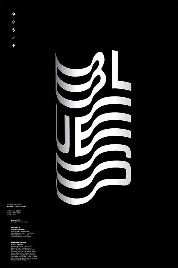
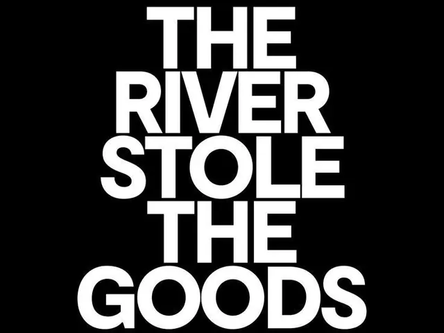
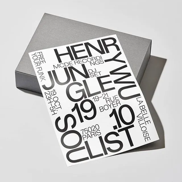
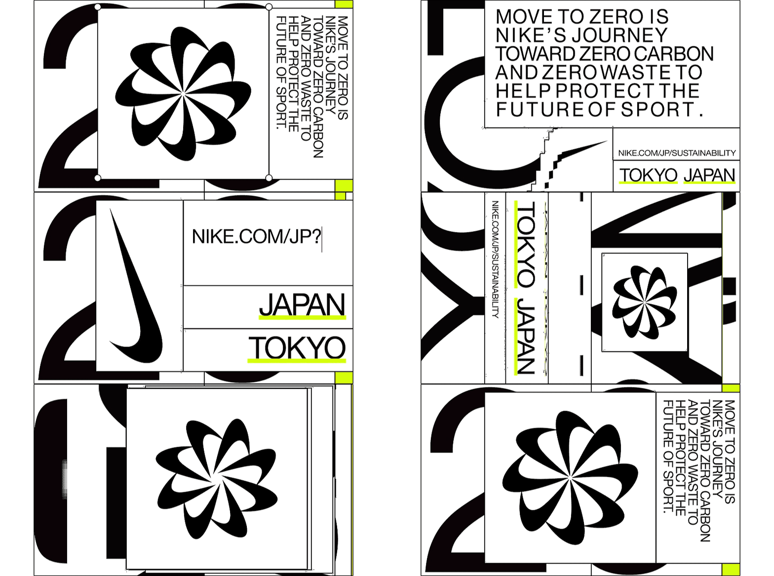
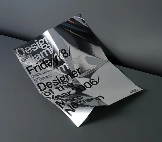
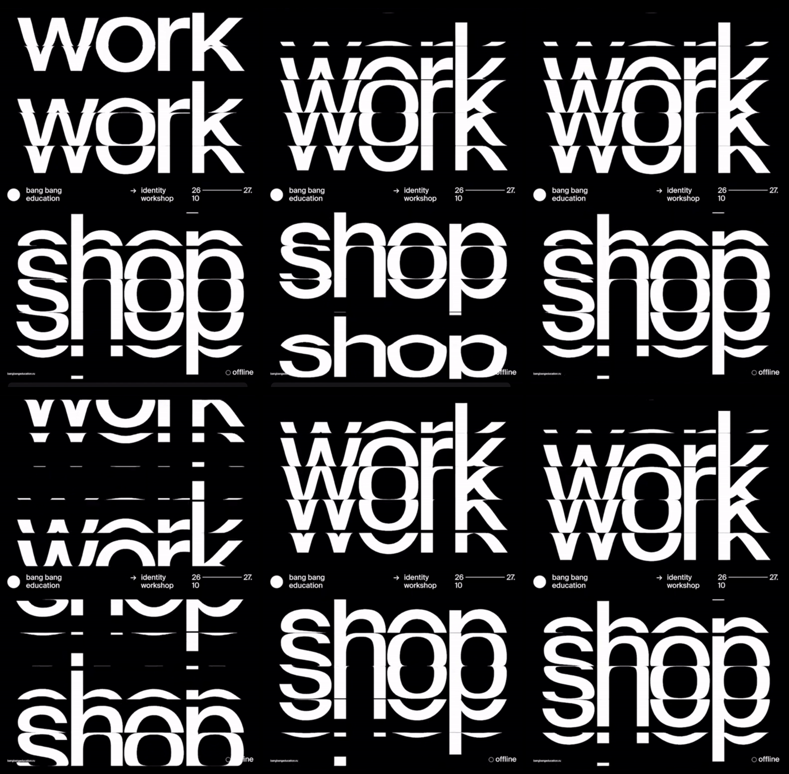
A black-and-white poster composition uses oversized stacked typography to spell out repeated words with horizontal slice distortions.
Summary
A black-and-white poster composition uses oversized stacked typography to spell out repeated words with horizontal slice distortions.
Visual description
A black poster shows three large stacked instances of the word "work" at the top, each cut horizontally by a thin distortion line. Below, the word "shop" is repeated in huge white type with the same sliced treatment, with small informational text and a simple circle marker in the margins.
Key takeaway
Use oversized sans-serif words as the primary graphic element, then break them with a thin horizontal slice to create tension and motion. Keep the supporting information tiny and sparse so the typography carries the entire composition.
Reuse notes
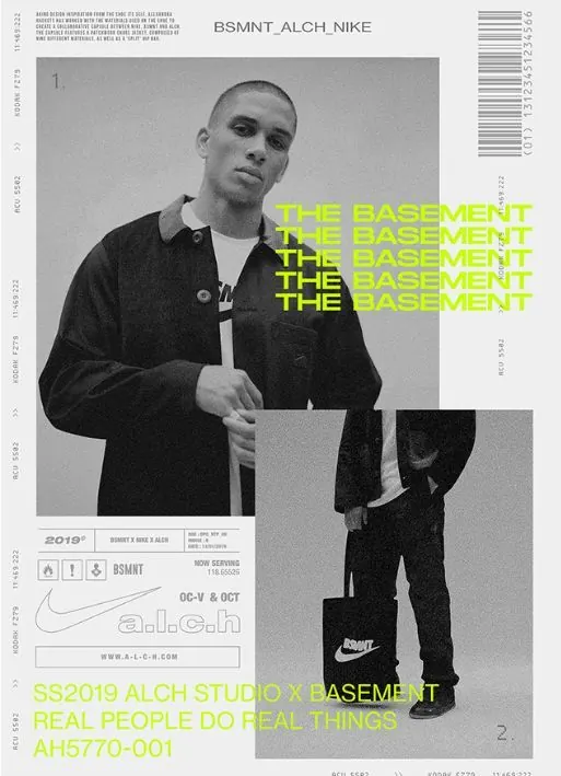
Best for posters, event graphics, identity studies, or any system that needs one bold typographic gesture to do most of the work. It fits brands that want to feel editorial, modern, and a little aggressive without adding imagery.