Preview image. Unlock full-res
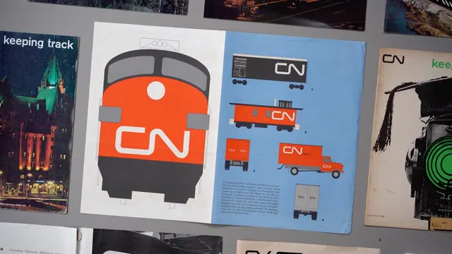
A design system document showing CN railway transportation branding with simplified icons of trains, trucks, and containers in a minimal geometric style.
Summary
A design guidelines spread featuring CN railway brand identity with flat geometric illustrations of locomotives, freight cars, and delivery trucks arranged on blue and neutral backgrounds.
Visual description
Photo of a design document spread showing two pages. The left page displays a bold front-facing train illustration in bright orange and dark gray with a simple white circle detail, set against a white background. The right page has a sky-blue background with five flat geometric vehicle silhouettes in orange and light gray: trains, boxcars, and trucks. Small descriptive text is visible below each illustration. The layout uses a Swiss grid-based approach. The document is surrounded by other branded materials showing additional design applications with green accents and photography.
Key takeaway
The geometric vehicle silhouettes demonstrate effective icon design for transportation and logistics branding. The bold orange against neutral backgrounds creates strong visual hierarchy while maintaining legibility at multiple scales.
Reuse notes
Strong reference for B2B branding and transportation identity systems. The flat geometric approach works well for system scalability and clarity. Good model for icon documentation and brand application guides that need to work across signage, vehicles, and digital applications.
More like this


Keep what you find
A free account saves references to boards and can send you a weekly email of picks based on what you save.
To see every result, go Pro.