Preview image. Unlock full-res
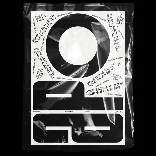
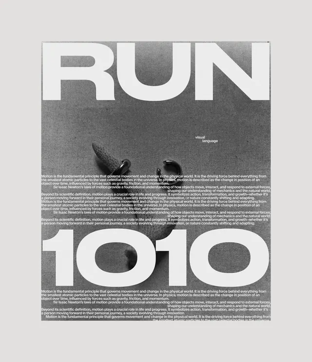
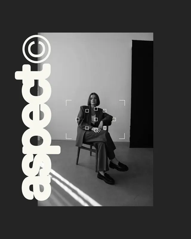
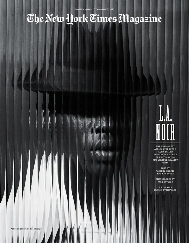
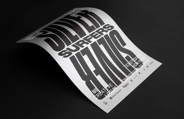
Award poster design for Creative Belgium Awards 2017 featuring warped 3D typography with horizontal striped lines creating an optical illusion effect on curved paper.
Summary
A monochromatic poster design for the Creative Belgium Awards 2017 featuring warped, striped typography rendered in an isometric 3D perspective, with the poster shown curved and floating against a dark background to showcase the optical effect.
Visual description
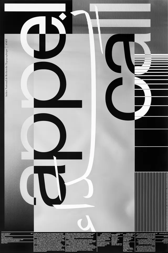
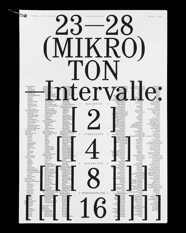
The design uses horizontal linear striping to create the letterforms, which spell "CREATIVE BELGIUM" prominently with additional event details below. The striped lines undulate and warp across the curved paper surface, creating a dynamic optical illusion. The 3D perspective shows the paper slightly lifted and curved in space with dramatic shadows beneath, emphasizing volume and dimensionality. The typography is constructed from the line pattern itself rather than solid forms, creating a sophisticated technical appearance. The monochromatic black and white palette with gray tones maintains maximum contrast. Small text and event information are positioned at the bottom.
Key takeaway
The power of linear pattern as a typographic element to create both form and dynamism. The warped/curved surface transforms static typography into a three-dimensional experience. The technique combines Swiss design rigor (clean lines, geometry) with creative interpretation. The optical illusion engages the viewer and creates memorability.
Reuse notes
Strong reference for awards campaigns, creative industry communications, or poster design emphasizing innovation. Excellent for design conferences, creative festivals, or industry recognition events. The linear striping technique is replicable across different contexts and messages. Works well for print and digital applications. The monochromatic treatment is versatile and works across many design contexts. The warping/3D perspective adds sophistication and prevents a flat appearance. Best used in contexts where technical innovation or creative thinking is the message. Avoid using in contexts requiring straightforward clarity or traditional presentation.