Preview image. Unlock full-res
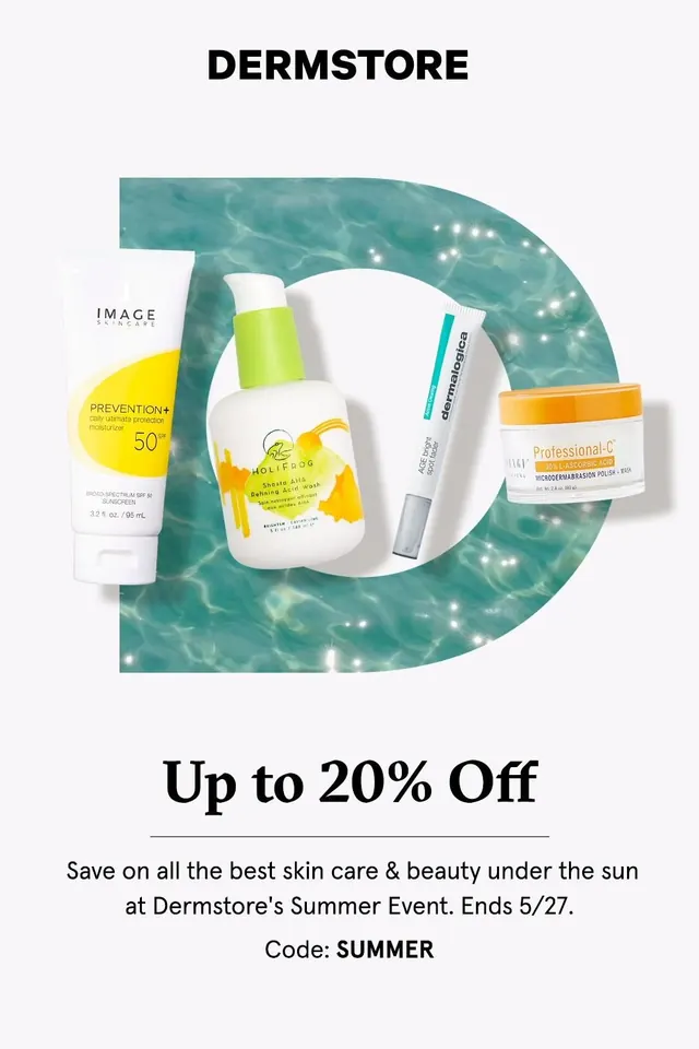
A clean skincare promotion poster for Dermstore with a large textured letterform, product cutouts, and an offer headline.
Summary
A clean skincare promotion poster for Dermstore with a large textured letterform, product cutouts, and an offer headline.
Visual description
A white poster features the word DERMSTORE at the top, a large teal water-textured letter D in the middle, and four skincare product cutouts arranged across it. Below, the headline says "Up to 20% Off" with a thin divider line and supporting sale copy ending with the code SUMMER.
Key takeaway
Use one oversized graphic letter or shape as the central hero and fill it with a vivid texture to create instant brand recognition. Layer product cutouts across that hero element so the promotion feels both editorial and commercial.
Reuse notes
This works well for beauty, wellness, and retail promos where a single offer needs to feel polished and premium. Reach for it when you want a simple layout with one strong focal device instead of a dense grid.