Preview image. Unlock full-res
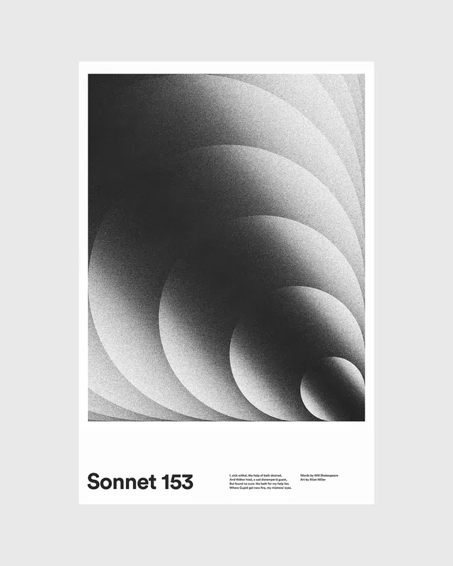
A minimalist poster design for Sonnet 153 featuring bold black sans-serif type at the base and an abstract gradient wave texture filling the upper portion, in a clean monochromatic palette.
Summary
A minimalist poetry poster in monochromatic gray tones, featuring a complex gradient wave texture in the upper half and bold sans-serif type reading "Sonnet 153" anchored at the base with small body text.
Visual description
The composition is divided into two visual zones. The upper two-thirds display a dynamic gradient wave texture: undulating parallel curves flowing from dark gray at the edges toward light gray in the center, creating a three-dimensional optical effect. The waves suggest movement and depth through tonal gradation and curved line rhythm. Below, a thin border separates the textural field from the typographic area. Bold black sans-serif type reads "Sonnet 153" in uppercase, anchored toward the bottom left. Small gray body text appears below, providing additional information. The monochromatic palette of pure black, white, and gray gradients creates refined, elegant simplicity.
Key takeaway
The poster demonstrates how subtle tonal gradation in abstract forms can create visual sophistication and interest without color. The balance between dynamic wave texture and calm typography creates visual hierarchy through contrast of visual density.
Reuse notes
Excellent template for poetry, literary events, cultural institutions, or academic contexts. The minimalist palette ensures versatility and dignity. The wave pattern offers visual interest without distraction from the text. Works well at various scales from poster to book cover. The approach could be adapted for other text-based content where sophisticated visual language is desired. The gradient wave technique could inspire patterns for other applications.