Preview image. Unlock full-res
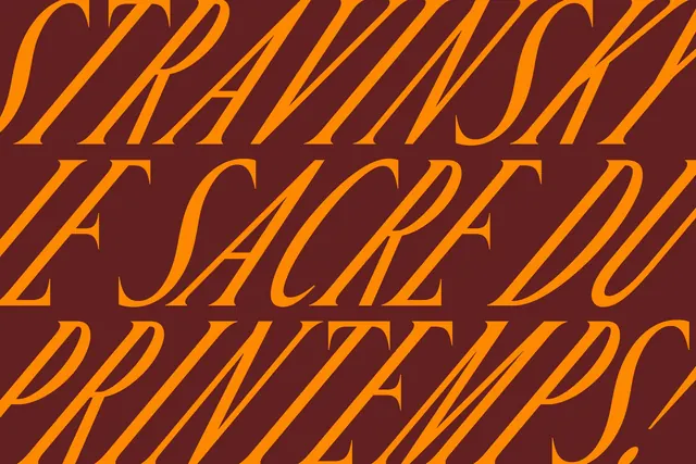
Bold graphic design study featuring diagonal striped serif typography in bright orange and deep burgundy, showing San Francisco Symphony identity exploration.
Summary
A creative exploration for San Francisco Symphony featuring bold serif type with diagonal striping treatment in striking orange and burgundy, part of a comprehensive identity system redesign.
Visual description
Graphic design composition divided into two bold color blocks: vibrant orange and deep burgundy. Large serif typography is positioned across the layout, with letterforms filled with diagonal striping that creates visual texture and movement. The serif typeface conveys cultural prestige and tradition. Multiple iterations of the striping and color application suggest this is an identity system exploration or guidelines page. Minimal additional elements allow the type and color treatment to dominate.
Key takeaway
The diagonal stripe pattern within letters creates visual rhythm and breaks up solid color, adding sophistication to a bold color contrast. The serif typeface signals cultural authority while the geometric striping modernizes it.
Reuse notes
Excellent for cultural institutions, orchestras, theaters, or high-end brands seeking a contemporary-yet-sophisticated identity. The orange-burgundy palette is warm and energetic; works well for arts marketing and event collateral. The geometric striping technique can differentiate a serif identity from competing institutions.
More like this


Keep what you find
A free account saves references to boards and can send you a weekly email of picks based on what you save.
To see every result, go Pro.