Preview image. Unlock full-res
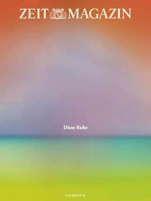
A full-bleed atmospheric gradient magazine cover for Zeit Magazin Nr. 43, transitioning vertically from terracotta orange at the top through dusty lavender to teal and chartreuse green at the bottom, with minimal centered type.
Summary
Zeit Magazin cover (9.10.2025, Nr. 43) built entirely from a slow vertical gradient -- terracotta to lavender to teal to chartreuse -- with the serif masthead at top, a single German title "Diese Ruhe" at center-left, and the date/issue number at the bottom.
Visual description
Portrait cover, no photography or illustration. The entire surface is an atmospheric color-field gradient that flows from a warm brick-red / terracotta at the top, softening through dusty rose and lavender in the middle third, shading into a muted teal band about two-thirds down, then opening into a fresh yellow-green / chartreuse at the bottom. The transition is smooth and haze-like with no hard edges. At the very top, the masthead "ZEIT MAGAZIN" is set in a small-to-medium cream-white serif with a heraldic crest device between the two words. About halfway down the page, slightly left of center, the issue's title "Diese Ruhe" (German for "This Calm") appears in the same cream-white serif at a modest size -- far smaller than a typical cover headline, underscoring the editorial restraint. At the bottom, a small line reads "9.10.2025 Nr. 43" in the same serif. No other type, no images, no rules.
Key takeaway
The commitment to a full-bleed color-field as the sole visual element -- no photography, no illustration -- lets the gradient carry all mood and meaning. The deliberately small, uncentered title placement breaks cover conventions and makes the cover feel more like fine-art print than newsstand tabloid. The warm-to-cool-to-warm hue progression (terracotta -- lavender -- teal -- chartreuse) avoids the predictable single-hue gradient while remaining cohesive.
Reuse notes
A reference for editorial covers or event posters where atmosphere and restraint are the message. Works best when the headline concept is abstract or emotional (e.g. "calm," "quiet," "waiting") -- a complex topic headline would fight the minimalism. The muted palette is soft enough for lifestyle and wellness, but the serif masthead keeps it in premium editorial territory. Not suitable for news-driven or information-heavy covers.
More like this
Keep what you find
A free account saves references to boards and can send you a weekly email of picks based on what you save.
To see every result, go Pro.