Preview image. Unlock full-res
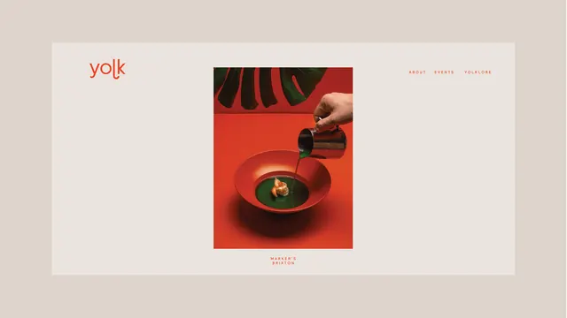
A magazine or portfolio cover layout featuring bold red and cream tones, with a dramatic food photography composition at center and minimal branding.
Summary
A bold editorial layout using red and cream tones, centered around high-contrast food photography and the minimal "yolk" logotype.
Visual description
A horizontal editorial composition with a cream background dominates most of the frame. In the upper left, the word "yolk" appears in warm red sans-serif type. The center features a dramatic square photograph of food being poured or served into a deep red bowl on a matching red background, creating visual drama and contrast. Navigation or section links appear in small red type in the upper right. The layout is perfectly balanced, with generous white space and clear hierarchy.
Key takeaway
Strong color contrast (deep red against cream) creates visual drama without overwhelming. The centered hero image approach makes the photography the star. Minimal typography and breathing room elevate the design and let the content shine.
Reuse notes
Excellent for: food and beverage brands, high-end culinary editorial, magazine cover design, portfolio or product showcase. The bold color contrast reads well at all sizes. Would work for fine dining, artisanal food, or any premium brand with strong visual content. Pair with short, impactful copy; the layout favors imagery over text.
More like this
Keep what you find
A free account saves references to boards and can send you a weekly email of picks based on what you save.
To see every result, go Pro.