Preview image. Unlock full-res
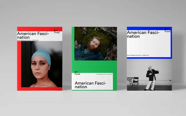
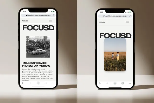
This is a clean, minimalist presentation showcasing photographic work paired with stark typography.
Summary
This is a clean, minimalist presentation showcasing photographic work paired with stark typography.
Visual description
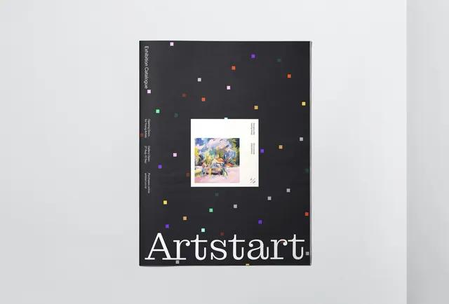
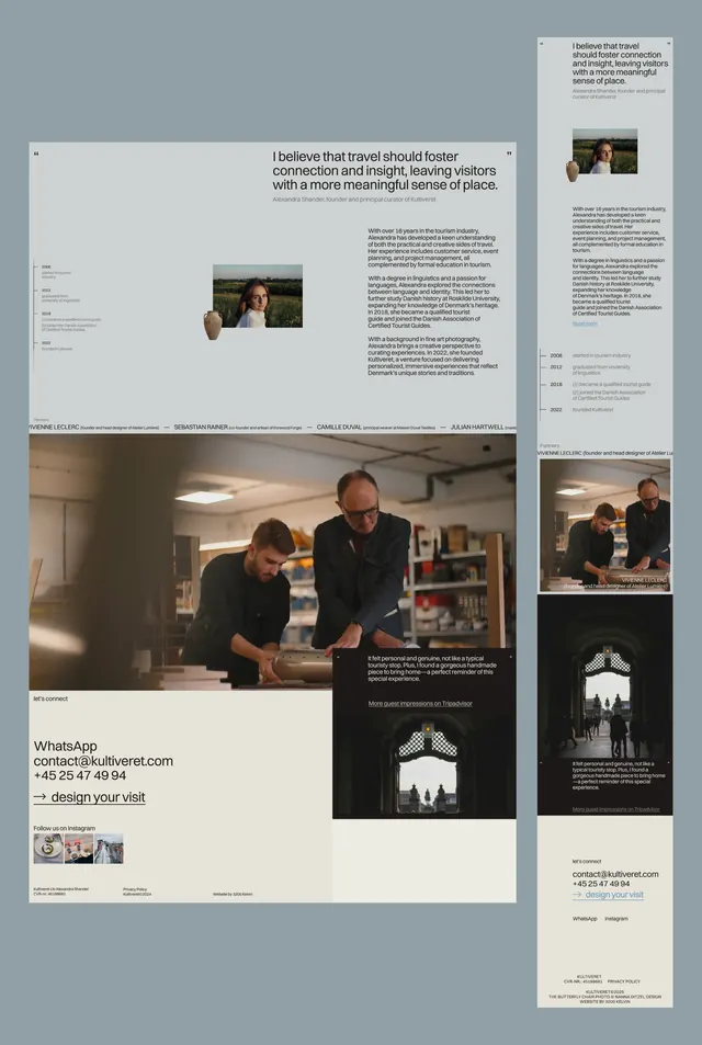
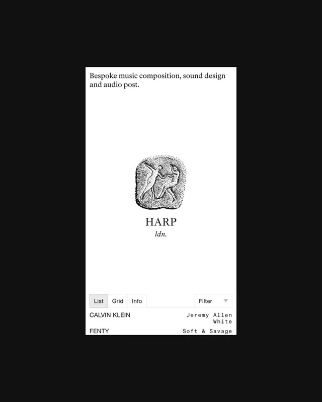
This is a clean, minimalist presentation showcasing photographic work paired with stark typography. The design uses high contrast and limited color palettes to create a serious, academic, and editorial feel suitable for art funding or portfolio display. The composition is structured as a horizontal triptych, with three distinct vertical panels providing visual separation while maintaining a cohesive brand identity. Clean, legible sans-serif typefaces are used for the titles and text, emphasizing clarity over ornamentation.
Key takeaway
An editorial spread reference. Worth saving for its minimalist, editorial, photographic treatment.
Reuse notes
Fits portfolio work.
More like this
Keep what you find
A free account saves references to boards and can send you a weekly email of picks based on what you save.
To see every result, go Pro.