Preview image. Unlock full-res
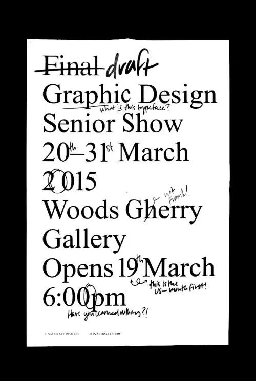
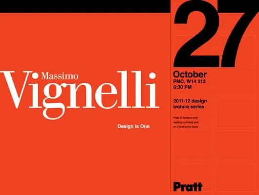
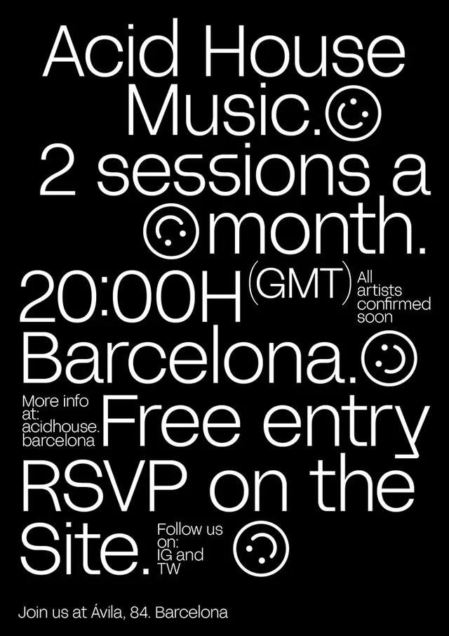
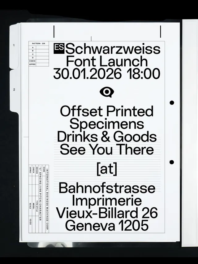
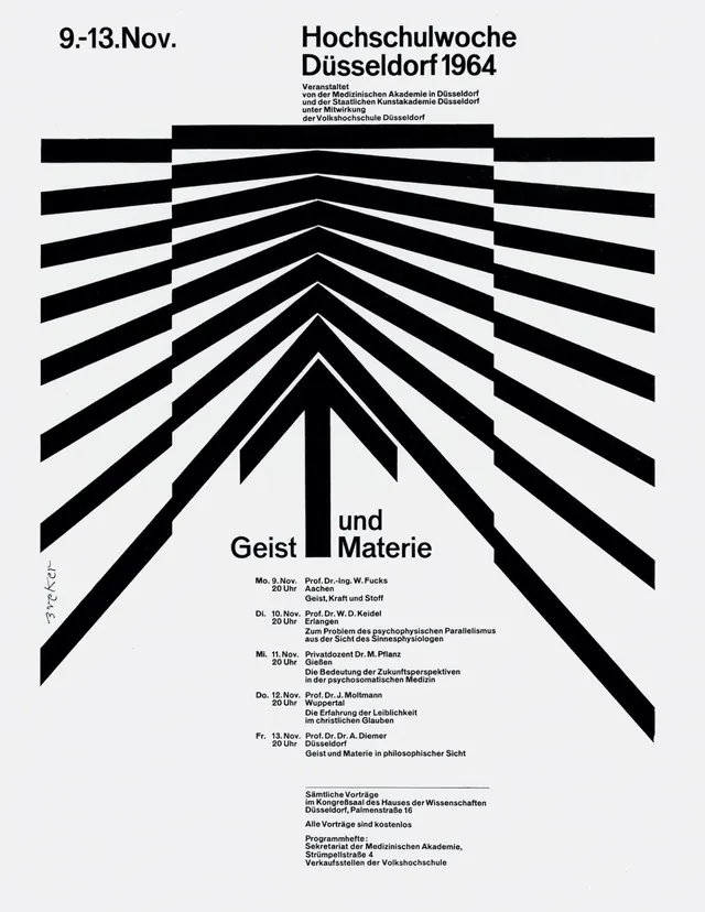
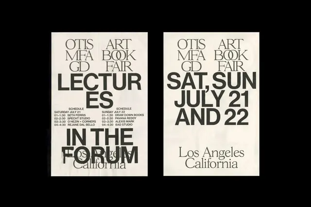
A minimalist, high-contrast typographic poster for an art event featuring a grid-based layout and bold text.
Summary
A minimalist, high-contrast typographic poster for an art event featuring a grid-based layout and bold text.
Visual description
Two side-by-side rectangular blocks containing black text on a white background. The left block features large, stacked 'LECTURES' text, while the right block displays dates and location in a structured, justified layout.
Key takeaway
Uses a strict grid and varying font weights to create visual hierarchy through scale and spacing.
Reuse notes
Apply this high-contrast, grid-based typographic layout for event announcements or editorial headers.