Preview image. Unlock full-res
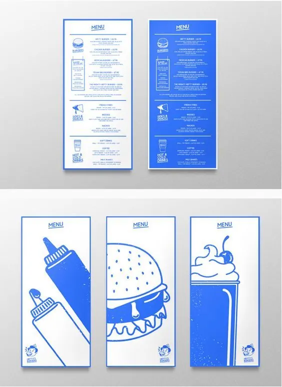
A set of blue-and-white menu poster layouts with large food illustrations and boxed text panels.
Summary
A set of blue-and-white menu poster layouts with large food illustrations and boxed text panels.
Visual description
The image shows two tall menu posters on the top row and three tall illustrated menu posters on the bottom row, all framed with thin blue borders on a light gray background. The designs use simple blue line art, small blocks of menu text, and oversized food illustrations like a burger, bottle, and drink.
Key takeaway
Use one strong accent color with lots of white space and thin architectural borders to make a menu feel crisp and memorable. Pair small, orderly text with one oversized illustrative hero element per panel.
Reuse notes
This approach works well for restaurant menus, cafe posters, and any printed food system that needs a distinctive visual identity. It is especially useful when you want the menu to feel graphic and branded without becoming visually crowded.