Preview image. Unlock full-res
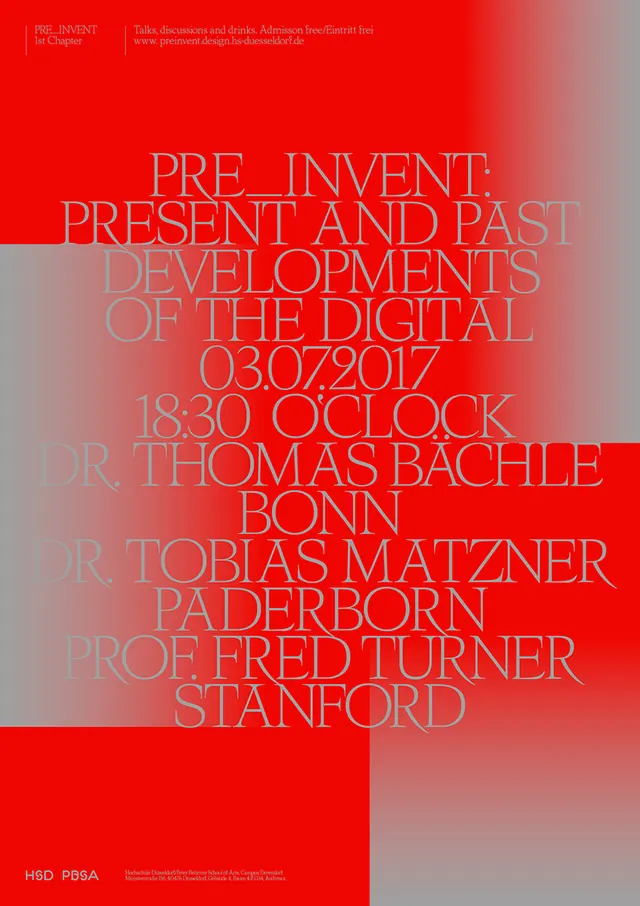
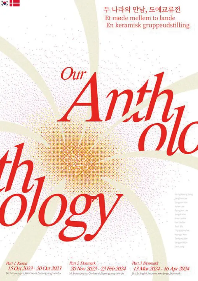
The design utilizes a bold, high-contrast color scheme dominated by red and muted gray tones, creating a sense of academic formality and urgency.
Summary
The design utilizes a bold, high-contrast color scheme dominated by red and muted gray tones, creating a sense of academic formality and urgency.
Visual description
The design utilizes a bold, high-contrast color scheme dominated by red and muted gray tones, creating a sense of academic formality and urgency. The layout is text-heavy, employing varied font weights to establish a clear hierarchy for the event details. The composition is structured with large blocks of color contrasting against areas of white space to organize the event information vertically. Sans-serif fonts are used, varying in size and weight to create a clear hierarchy for titles and names.
Key takeaway
A type specimen reference. Worth saving for its minimalist, academic, high-contrast treatment.
Reuse notes
Fits media work.
More like this

Keep what you find
A free account saves references to boards and can send you a weekly email of picks based on what you save.
To see every result, go Pro.