Preview image. Unlock full-res
A series of 30 experimental Japanese typography pieces exploring kanji and kana through bold stylistic treatments including dot-matrix, contour lines, calligraphy, and pixel forms.
Summary
A series of 30 experimental Japanese typography pieces exploring kanji and kana through bold stylistic treatments including dot-matrix, contour lines, calligraphy, and pixel forms.
Visual description
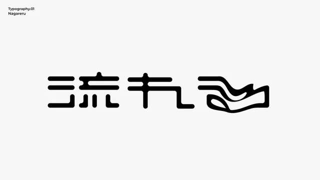
Four heavily stylized kanji characters rendered in thick black geometric forms against a light beige background. Each character is constructed from bold horizontal strokes, vertical bars, curved lines, and abstract shapes rather than traditional brush work. The letterforms occupy most of the frame and demonstrate extreme contrast between the sculptural solids and white space. The aesthetic leans minimalist and modern, treating written language as pure geometric form.
Key takeaway
Transform characters into abstract modular shapes using only thick strokes and negative space, stripping away any ornamental detail. This approach proves that legibility can be secondary to visual impact when exploring experimental letterforms.
Reuse notes
Reach for this as a editorial spread reference. Pairs with typographic, experimental directions. Original by 市川央.