Preview image. Unlock full-res
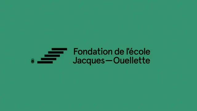
The design is minimalist and corporate, utilizing a simple geometric mark to represent the organization's name.
Summary
The design is minimalist and corporate, utilizing a simple geometric mark to represent the organization's name.
Visual description
The design is minimalist and corporate, utilizing a simple geometric mark to represent the organization's name. The visual language is clean and modern, relying on negative space and a monochromatic palette to convey a sense of stability and professionalism. The composition is centered, featuring a simple graphic element aligned to the left, with text positioned to its right against a solid background. Sans-serif typeface, clean and legible.
Key takeaway
A type specimen reference. Worth saving for its minimalist, corporate, modern treatment.
Reuse notes
Fits education work.
More like this



Keep what you find
A free account saves references to boards and can send you a weekly email of picks based on what you save.
To see every result, go Pro.