Preview image. Unlock full-res
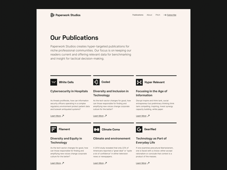
A publications overview page displaying six publication titles in a 3x2 grid, each with an icon, title, subtitle, and 'Learn more' link on a cream background.
Summary
A publications overview page showing six titles in a clean 3x2 grid with iconic logos, each card pairing a publication name with a short descriptor and a 'Learn more' link.
Visual description
Cream background page with "Our Publications" heading and introductory paragraph. Six publication cards arranged in two rows of three. Each card contains: a square logo or icon in the top-left, a bold publication title, a one-line descriptor below the title, and a "Learn more" link aligned left. Titles include White Casa, United, Hyper Relevant (top row) and Flaneur, Climate Dome, Stratified (bottom row). Thin horizontal lines separate each row. Black text on light background throughout, using sans-serif typography.
Key takeaway
Effective card-based grid system for presenting a publication or product catalog. The icon-plus-text approach reduces cognitive load while maintaining clear hierarchy and scanability.
Reuse notes
Ideal for media companies, publishers, or studios showcasing multiple offerings. The grid format works at various breakpoints. Each card is independent and scannable, allowing users to quickly browse and decide what interests them.
More like this

Keep what you find
A free account saves references to boards and can send you a weekly email of picks based on what you save.
To see every result, go Pro.